Five Ways to Nudge Labmates Toward Better Data Management

This post is aimed at the graduate students, post docs, and research scientists who have established good data management practices in their own work and now want to make a positive impact on their peer’s data management.

It can be challenging to talk to others about data management when you don’t have the authority to direct everyone in your research group to manage their data in a specific way. The person with the most authority to make a group implement good data practices is the head of the lab, but lab members also have the ability to impact their peers, though they have to be more considerate about it.

Here I’m suggesting a few gentle ways to introduce good data habits to labmates or start a conversation about data management without requiring someone else to implement a specific data practice:

1. Pick a data management paper for group meeting discussion.

Many research labs have group meetings where they discuss relevant publications in their field. While these articles often center around the group’s research field, paper discussions present an opportunity to introduce other research-related topics, like data management, to a larger group. Consider picking an article, such as my “Foundational Practices of Research Data Management” paper, at a future group meeting to introduce your peers to the overall topic.

2. Use a file naming convention when you share data with others.

File naming conventions are one of my favorite data management strategies to teach about and use. They also represent a great teach-by-example moment for when you have to share files with others. Sharing well-named files – plus the guide for interpreting these file names – provides a natural opportunity to demonstrate the benefits of good file naming and start a discussion about this data management practice.

3. Initiate a discussion about how to organize data on the shared lab server.

If a lab has a shared server, there’s a good chance that it’s a chaotic jumble of files (unless there’s a lab manager keeping everything organized). That’s not to say that you need to jump in to organize everyone’s files. Rather, initiate a conversation with lab members to develop a shared set of rules on how files should be organized and stored on the shared server. To be extra helpful, you can write these rules down in a README file and save it in the shared drive as documentation for future labmates.

4. Talk to the head of your lab about data permissions.

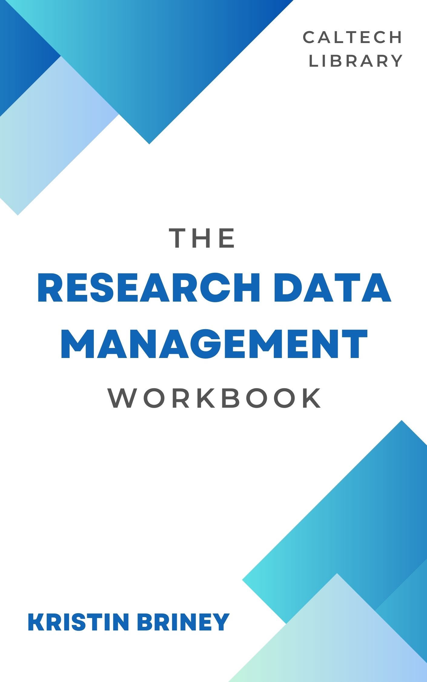
Ask the head of your lab if you are allowed to take a copy of data with you when you leave the laboratory and if you can publish with that data and under what conditions; for a full list of questions to ask, see the Determine Data Stewardship exercise from my Research Data Management Workbook. While this action doesn’t directly impact your peers, having a conversation with the head of the lab about data permissions makes the lab head aware that this is an issue for all lab members that should be addressed.

5. Ask a peer to review your research notes for clarity.

After undergrad, it’s not very common to have someone review our research notes. Yet getting peer feedback on notes can help ensure that we’re documenting our research at a level sufficient for reproducibility by someone with similar training. By taking this step, not only are you starting a conversation about good notetaking with a peer, you can also benefit from their feedback on your notes!

There are more ways to introduce peers to the topic of data management beyond these five ideas, but hopefully I’ve given you a starting point to consider the power that each of us has to help those around us with data management, even when we lack the authority to require good data practices.

Posted in dataManagement | Leave a comment

The Research Data Management Workbook

I am beyond thrilled to share with you my third book, The Research Data Management Workbook. This book is free and openly licensed (CC BY-NC), available both online and as a PDF or EPUB download. Here’s the citation:

If you’ve been following the blog, you know that I’ve written extensively about practical data management. One of the challenging parts of data management education, however, is helping researchers bridge the gap between data management principles and implementing routine, customized data management strategies in their research practices. Part of this challenge has to do with the fact that data management, when done well, gets adapted to local context; for example, there is not one correct way to name a data file, rather there is a best way for you to name your data files.

The Research Data Management Workbook was designed to help researchers with implementing data management practices by providing them with structured, reproducible exercises for discrete data management tasks. For example, the Workbook exercise to improve notetaking centers on evaluating a previous laboratory notebook entry from 6-12 months ago. In the exercise, you: read through the old notebook entry; summarize what the entry was about; identify what information might be missing; evaluate if you could reproduce that entry’s research; highlight good and bad things about your notetaking; and then determining what improvements you should make to your notetaking going forward. It’s nice to know notetaking best practices to do the exercise, but the real focus is on key questions about your research practices and guiding you toward improvements that you specifically need to make.

The Research Data Management Workbook contains 15 exercises from across the data lifecycle, over half of which are completely new to the Workbook (most of the exercises from previously existing materials have been heavily edited and improved, though my favorite exercise on file naming conventions is in the Workbook and will look familiar). The majority of exercises are worksheets, designed for you to fill in answers to targeted questions, with a few checklist exercises and a pair of procedures.

The Workbook was published by Caltech Library and is free to download, use, and adapt, so long as you cite the original source and are not selling the material (the Workbook is under a Creative Commons Attribution Non Commercial 4.0 International license). I anticipate updating the Workbook over time and adding new exercises, so I would love to hear feedback – good or bad – to make the next editions even better.

I hope that you enjoy The Research Data Management Workbook and find it useful!

Posted in admin, dataManagement, dataManagementPlans, dataStorage, documentation, labNotebooks | Leave a comment

Leaving the University

Don’t worry, I’m not actually leaving my job. Rather, I’ve been thinking about what happens to data when a researcher leaves a university.

For how common separation is, it’s often a time during which data gets lost because there usually aren’t rules or structure for how to account for data during this transition. Without proper discussion, it can also be unclear what rights the departing researcher has over the data and if they are allowed to republish with it.

To help with these problems, I got together with my friend and research collaborator Abigail to come up with the Data Departure Checklist. The goal of the checklist is to account for all of the data, decide who gets to keep what data, and set both the individual and the lab they are departing from up for success going forward.

Goben, A., & Briney, K. A. (2023). Data Departure Checklist. https://doi.org/10.7907/h314-4×51

To use the checklist, the departing researcher and a project administrator should sit down and work through all of the items on the list. There are sections for hardware, personal devices, storage systems, data permissions, administrative documentation, manuscripts in progress, administration, and email. The researcher and administrator should both check off that the relevant item has been taken care of appropriately. The goal is to make the departure process more transparent and streamlined.

This is our first draft of the checklist so let us know if you use it and/or think of ways to improve it! We hope this is a useful tool for researchers.

Posted in dataManagement | Leave a comment

The Last of the Data Doubles Publications

It’s been pretty quiet on the blog, though it definitely has not been quiet in real life. I have lots of things that I’m looking forward to sharing with you!

First off, I had a pair of papers published this summer from the Data Doubles project. The first paper is the result of focus groups around student expectations of privacy from three different educational data scenarios:

Jones, K. M. L., Goben, A., Perry, M. R., Regalado, M., Salo, D., Asher, A. D., Smale, M. A., & Briney, K. A. (2023). Transparency and Consent: Student Perspectives on Educational Data Analytics Scenarios. Portal: Libraries and the Academy, 23(3), 485–515. https://doi.org/10.1353/pla.2023.a901565

No paywall version here: https://resolver.caltech.edu/CaltechAUTHORS:20230711-164456715]

The second article covers the development of the large, reproducible survey (published here) we did the in the second phase of the Data Doubles research:

Asher, A., Briney, K., & Goben, A. (2023). Valid questions: the development and evaluation of a new library learning analytics survey. Performance Measurement and Metrics, 24(2), 101–119. https://doi.org/10.1108/PMM-04-2023-0009

No paywall version here: https://resolver.caltech.edu/CaltechAUTHORS:20230720-155500670

These two papers wrap up the work I’ve done on that huge project. I miss working with everyone but we did get some great findings out of the work! I hope you enjoy them.

Posted in privacy | Leave a comment

Visualizing COVID in Fiber, Part 2

It’s been two years since I posted about my 2020 US COVID daily fatalities handwoven visualization. I have had many interesting conversations about that piece (for examples, see here) and it’s one of my handmade projects for which I am most proud.

The thing is, though, the pandemic is not over. And the ongoing US COVID fatalities have been as numerous and terrible and just as worth of highlighting as the 2020 deaths. So I made the 2021 version of the visualization.

Person hidden behind a narrow vertical piece of fabric made up of small red and dark red hexagons. The top quarter of the fabric is dark red, with red hexagons through the middle, and mostly dark red in bottom third. In the background is a green yard with plants and bushes.

I finished the visualization in March of last year and finally hung it up in my office, directly below the 2020 version. The color representation is the same between the two visualizations, though 2021 version only uses red hexagons (100-999 deaths) and dark red hexagons (1000+ deaths). If anything, the 2021 version is more depressing because of the advances in science (e.g., vaccines) that were countered by disregard for that science (e.g., anti-masking sentiments), leading to thousands of deaths.

White wall of an office with two long fabric strips hanging toward the top of the wall, one strip on top of the other. The top strip is thin and long, starting white on the left and transitioning to red, with three large dark red patches. The lower strip hangs directly below the first and is dark red on the ends and red in the middle. Other office furniture, art, and books are visible.

Since it’s the start of 2023, I’m reflecting on whether I want to make the 2022 version. It’s a lot of labor but our ongoing COVID losses are a story that still needs to be told. That said, the CDC moved from reporting daily deaths to reporting weekly deaths, so I don’t have an equivalent dataset for this past year. (Notably, you can see the move toward less frequent reporting at the end of 2021, where reported deaths at the end of the year are lower on the weekends than during the week.)

White woman with glasses and braided brown hair wearing a colorwork-yoked sweater stands in front of the picture as a selfie. In the background, two long narrow strips of fabric hang on the white wall behind her. The fabric is made up of small hexagons in colors ranging from white and pink to red and dark red.

I don’t yet have an answer for how to handle the 2022 data. It’s a bigger question of how to adjust when a dataset changes. Do I average weekly data to fit everything into the existing format (e.g. rows of identically colored hexagons)? Do I visualize weekly data (e.g. one long thin strip) and, if so, how to I make this harmonize with my existing visualizations?

There are no “best” answers here. But I do know that we need to remember those that we’ve lost in this ongoing pandemic, however that might look.

Posted in dataVisualization | 1 Comment

A Summary of Research Data Documentation Methods

A phrase that often comes up when data librarians speak about documentation is that “documentation is a love letter to your future self.” Basically, documentation is necessary because research data rarely speak for themselves and researchers forget details over time; therefore documentation is necessary in order to interpret data in the future.

Different disciplines gravitate to different forms of documentation (e.g. chemists use laboratory notebooks but social scientists running surveys more often leverage codebooks) but this often means that researchers are not aware of the full scope of documentation methods beyond what is preferred within their discipline. While I’ve written a lot about documentation on this blog already, I wanted a quick way to show researchers the full range of documentation possibilities. So I developed a 2-page handout that summarizes different forms of documentation and when to use them.

The handout summarizes seven different documentation forms to expose researcher to methods that might improve their data management and work better in certain parts of their research workflow. These seven methods include:

  • Laboratory Notebook, Field Notebook, or Research Notebook
  • e-Lab Notebook (ELN)
  • README.txt
  • Templates: Data Sheet, Collection Sheet, or Field Sheet
  • Data Dictionary
  • Codebook
  • Metadata Schema, Standard, or Taxonomy

I’ve blogged about most of these documentation types in more detail, but I hope it’s helpful to be able to review them all in one place.

Please do check out the new documentation handout and feel free to reuse it – it’s licensed under a Creative Commons Attribution (CC BY) license, meaning you are welcome to use and remix it so long as you credit me. And thank you to Tom Morrell and Megan O’Donnell, who reviewed earlier version of this handout and suggested improvements.

I hope this new resource is helpful to you all!

Posted in documentation | Leave a comment