It’s been two years since I posted about my 2020 US COVID daily fatalities handwoven visualization. I have had many interesting conversations about that piece (for examples, see here) and it’s one of my handmade projects for which I am most proud.
The thing is, though, the pandemic is not over. And the ongoing US COVID fatalities have been as numerous and terrible and just as worth of highlighting as the 2020 deaths. So I made the 2021 version of the visualization.
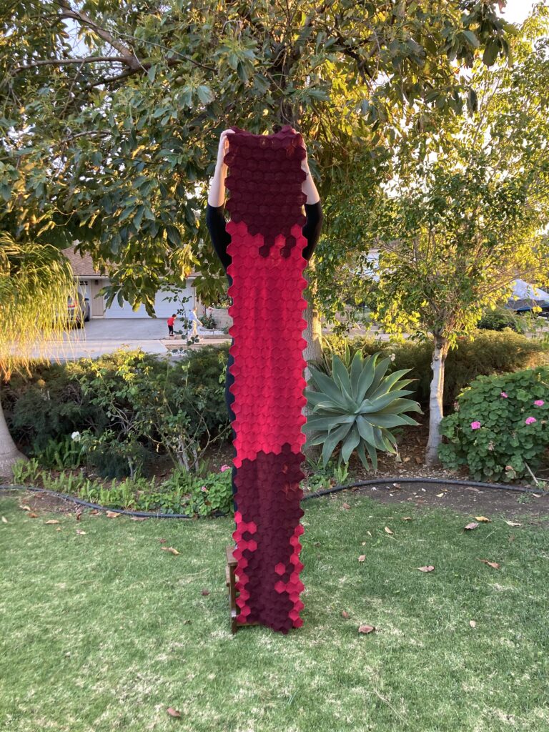
I finished the visualization in March of last year and finally hung it up in my office, directly below the 2020 version. The color representation is the same between the two visualizations, though 2021 version only uses red hexagons (100-999 deaths) and dark red hexagons (1000+ deaths). If anything, the 2021 version is more depressing because of the advances in science (e.g., vaccines) that were countered by disregard for that science (e.g., anti-masking sentiments), leading to thousands of deaths.
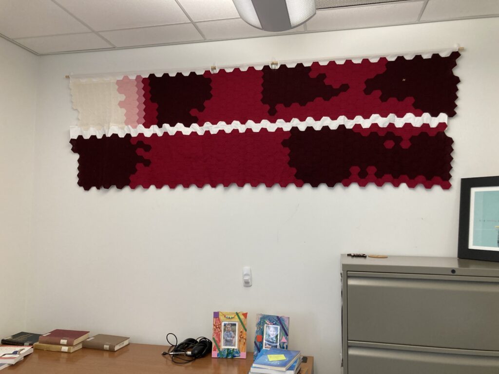
Since it’s the start of 2023, I’m reflecting on whether I want to make the 2022 version. It’s a lot of labor but our ongoing COVID losses are a story that still needs to be told. That said, the CDC moved from reporting daily deaths to reporting weekly deaths, so I don’t have an equivalent dataset for this past year. (Notably, you can see the move toward less frequent reporting at the end of 2021, where reported deaths at the end of the year are lower on the weekends than during the week.)

I don’t yet have an answer for how to handle the 2022 data. It’s a bigger question of how to adjust when a dataset changes. Do I average weekly data to fit everything into the existing format (e.g. rows of identically colored hexagons)? Do I visualize weekly data (e.g. one long thin strip) and, if so, how to I make this harmonize with my existing visualizations?
There are no “best” answers here. But I do know that we need to remember those that we’ve lost in this ongoing pandemic, however that might look.


One Response to Visualizing COVID in Fiber, Part 2