I wrote last month about making spreadsheets more accessible and reusable, and I want to continue in the theme this month by discussing accessibility of scientific figures.
I don’t have capacity in this blog post to do justice to the full topic of accessibility for scientific images. If you are interested in the basics of creating accessible data visualizations, I recommend you check out Chartability by Frank Elavsky and the Do No Harm Guide: Centering Accessibility in Data Visualization report by Jonathan Schwabish, Susan J. Popkin, and Alice Feng. There are many more resources available on the internet in this area, but those two links are a good place to start.
In this post, I want to discuss a more foundational requirement for accessibility and visualizations: alt text for scientific figures. Alt text, short for “alternative text”, is a textual description of a digital image. This text is critical for blind and low vision people whose screen reader software cannot otherwise interpret images; without alt text, blind people miss all information or context provided by a figure. Alt text also helps with search engine optimization and is presented instead of an image when the image file cannot load (due to low bandwidth, etc.).
All images on the internet should have accompanying alt text. But alt text isn’t something that comes up regularly when discussing the sharing of research results. So how do you write alt text for a scientific figure?
If you don’t know anything about writing alt text, you should start with Amy Cesal’s guidance on writing alt text for data visualizations. Her alt text formula is as follows:
alt text = *Chart type* of *type of data* where *reason for including chart*. *Link to source data.*
Let’s look at an example using this figure from my most recent publication:
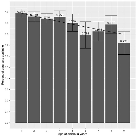
The chart type is “column chart” and the type of data, or y-axis data, is best summarized as “research data availability”. The point of the figure is that “research data on the internet disappears at a rate of 2.6% per year”. Using Cesal’s formula, the alt text for this figure would be :
Column chart of research data availability where research data on the internet disappears at a rate of 2.6% per year. For underlying data, see “Figure2_UnavailableByYear.csv” file at https://doi.org/10.22002/h5e81-spf62.
There are further examples in Cesal’s post to give you a better sense of how the formula works. She also advises repeating the formula for each separate panel in a multi-part scientific figure.
If you want to go beyond Cesal’s basic alt text for data visualizations, chapter four of the Do No Harm Guide offers a really nice look into several models for writing full alt text descriptions for visualizations. The image description guidelines from the DIAGRAM Center also provide more detailed recommendations for specific types of images, such as: chemical elements, Venn diagrams, line graphs, etc. Cesal’s shorthand formula is useful but fuller descriptions are preferable when you are able to write them.
I know this post links to a lot of information about alt text but the important thing is to have something written as alt text because so many images on the internet have no alt text at all. If you want to use Cesal’s quick formula instead of a fuller description, that’s 100 times better than having no image description at all.
Hopefully these resources have prompted you to think more about accessibility of your scientific visualizations so that, at the very least, you’ll include good alt text for the scientific images you share on your lab website, social media, or anywhere!