A side effect of being a data specialist-by-day and a crafter-by-night, is that the two sometimes combine. This leads to things like the bad passwords dress and the women in science dress, but more recently, I’ve been dabbling in data visualization with fiber. This is my first finished visualization project.
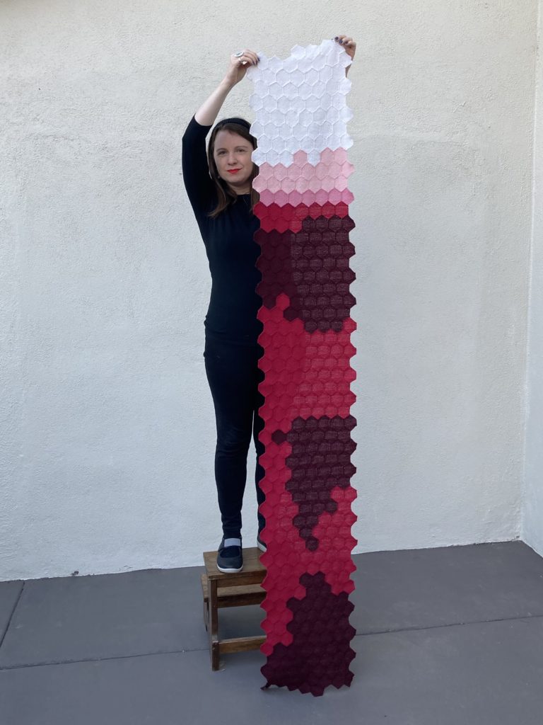
This is a scarf representing the daily U.S. COVID fatalities in 2020. Each 2″ woven hexagon represents the number of reported deaths from COVID on a single day in the United States, starting on January 1, 2020 and ending December 31, 2020.
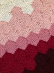
To interpret the visualization, you need to know how the data is laid out and what the colors mean. Data is laid out by week exactly as it appears on the calendar, with each week starting on Sunday and ending on Saturday. I represented the number of deaths on a logarithmic scale by color, where:
- white = 0 deaths
- light pink = 1-9 deaths
- dark pink = 10-99 deaths
- red = 100-999 deaths
- dark red = 1000+ deaths
The data was pulled from The COVID Tracking Project at The Atlantic and used under a Creative Commons CC BY 4.0 license. https://covidtracking.com/
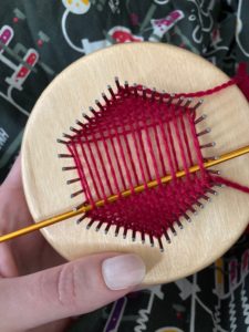
For those interested in the crafting part of the project, I wove the hexagons on a 2-inch, fine-sett turtle pin loom using KnitPicks Palette yarn. Full crafting details are available on this Ravelry page.
I don’t think we, as a society, have entirely processed the half million deaths (and counting) from this pandemic. This visualization was one way for me work through the massive loss. It was very surreal to weave a dark red hexagon and realize that it represented over 1,000 people on one day. And then acknowledge that there are over 150 dark red hexagons on the scarf.
For me, this visualization also represents imperfection and I embrace that. Color-coding on a log scale distorts the numbers but was a necessary trade off to limit yarn colors. I also see artifacts in the data, especially in August and November, where deaths are reported in lower numbers on Sundays and Mondays. Perhaps most importantly, I recognize that these numbers only represent reported deaths, so are not an accurate picture of the total loss from COVID. Nor do the numbers show impacts we all feel from that loss.
I don’t know if I’ll do a second half of this scarf representing 2021. But I will say that it’s my fervent wish that that visualization would be made up of mostly white hexagons. Until then, wear a mask, keep your distance, and get vaccinated when you are able to.


2 Responses to Visualizing COVID in Fiber