One of my recent posts touched how powerful R is for data cleaning and manipulation, but I want to take a step back and recognize that a ton of science gets done in Excel. And while Excel has many limitations (cough dates cough), it does have a place in the research toolkit. So it’s worth discussing some of the more powerful features of the software to get the most out of using it.
In this post, we’re going to talk about a useful feature in Excel that not everyone knows about: pivot tables. If you’re already using pivot tables, you can skip this post entirely and go have a cup of tea instead. But for everyone else, let me blow your mind.
If you know how to write functions in Excel, you know that Excel can easily calculate sums, averages, and counts across all values for one variable in a dataset. What’s more difficult to do is segment that variable into subgroups and calculate sums, average, and counts for each distinct subset. This is where pivot tables come in.
For example, say I did a survey on college students where one variable in my dataset lists year in school (a text value) and another variable contains Likert scale data (a 1-5 integer rating value). I want to know how many freshman, sophomores, juniors, and seniors there are in the dataset. A pivot table can do that. Another example would be calculating average Likert response value for each year-in-school. Or create a simple table with year-in-school as the rows, Likert value as the columns, and counts of responses as the table entries. Pivot tables can do these too. Basically, any time you want to group your data into subsets and run some simple summary statistics on those subsets, you want a pivot table.
The nice thing about Excel is that it has a little wizard for making pivot tables that, with practice, is fairly straightforward to use. (Note: I’m working in Excel 2016.) To get started, highlight the data you want to analyze, click “Insert/PivotTable”, and select where you want to put your data.
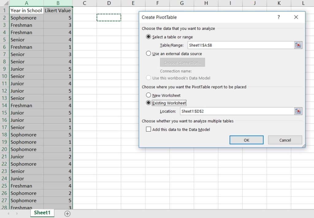
Doing this drops in an empty pivot table and opens the PivotTable wizard.
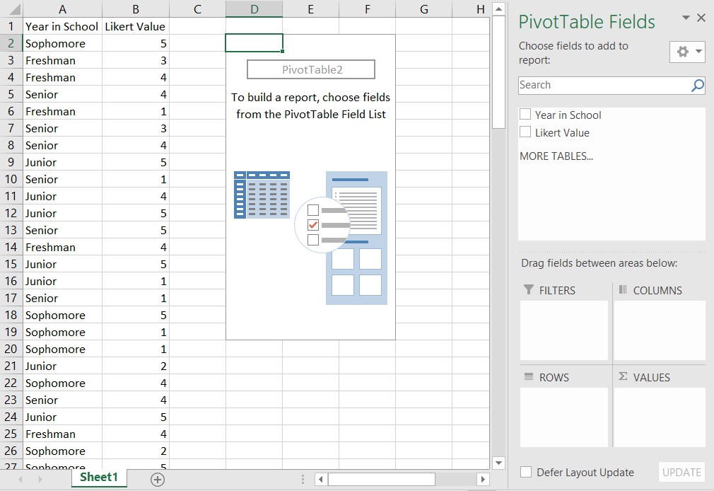
Let’s start with the example of getting counts of how many freshman, sophomores, juniors, and seniors there are in the dataset. Drag-and-drop the “Year in School” label from the top of the wizard (under “PivotTable Fields”) down to the “Rows” box at the bottom of the wizard; this will put a list of years into your pivot table but no data. Next drag the “Year in School” label from the top into the “Values” box at the bottom right of the wizard; this will add values to your table. Note that the standard Value defaults to count. Now you have the table you need!
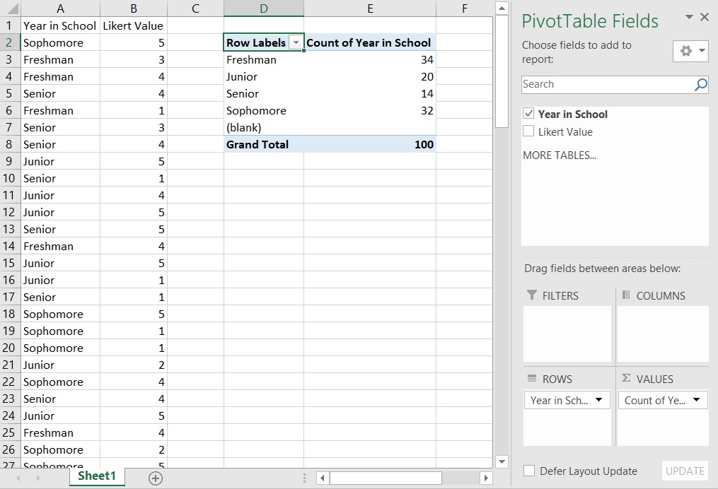
[Exercise: how would you create a table displaying how many times the Likert values 1-5 appear in your dataset?]
In the next example, we’ll look at average Likert value by year-in-school. To remove the current count data, you can either: make a new pivot table, drag-and-drop variables out of the “Values” box, or click the arrow next to a variable in the “Values” box and select “Remove Field”. With “Year in School” in the “Rows” box, drag-and-drop “Likert Value” into the “Values” box. Again, the default is count, which isn’t what we want here. Click the arrow next to “Count of Likert Value” in the “Values” box and select “Value Field Settings…”; this opens up a menu where you can select different functions, one of which is “Average”. Change to average and now you have a table of Likert averages displayed by year-in-school!
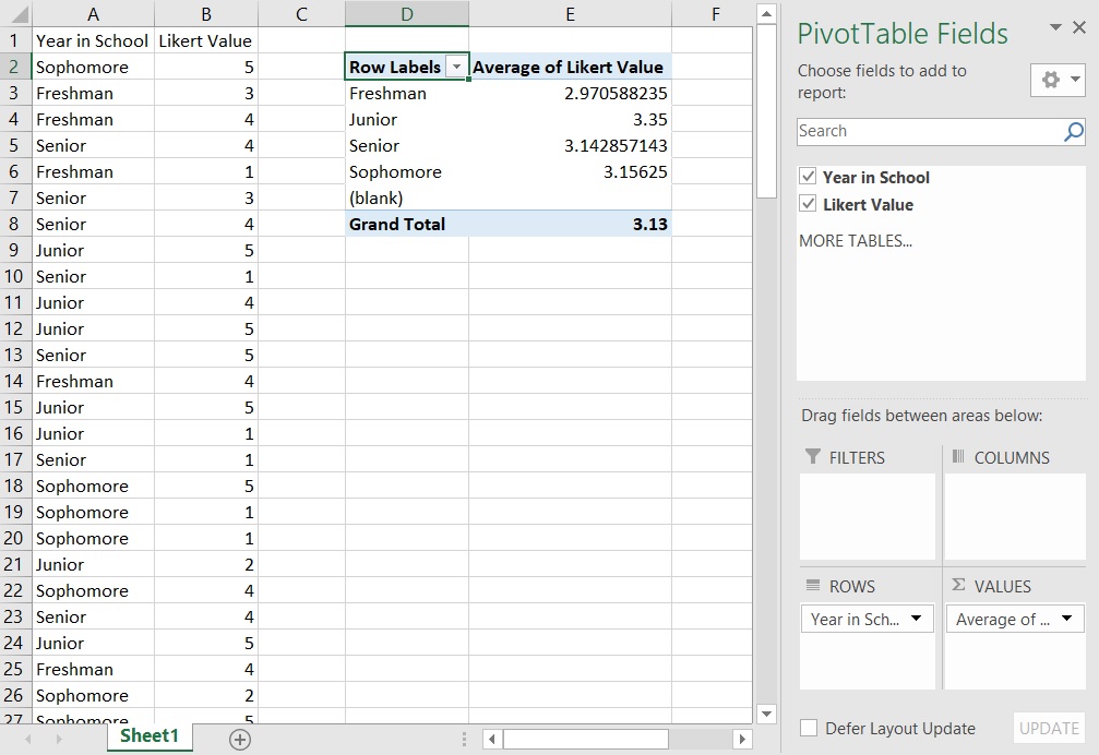
[Exercise: how would you calculate standard deviation of Likert values for each year-in-school? Can you display both average and standard deviation in the same table?]
Our final example will add columns to our table. Reset your table. Drag-and-drop “Year in School” to the “Rows” box in the wizard and “Likert Value” into the “Columns” box. Drag “Likert Value” into the “Values” to populate the count data. And now we have our table of response counts broken down by both year-in-school and Likert value. The pivot table also shows totals across both rows and columns, which is a handy check to see if the data looks right.
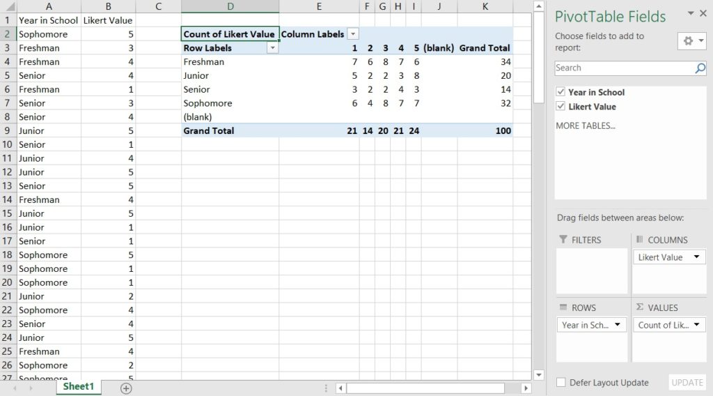
[Exercise: how would you re-arrange this table to show year-in-school as columns and Likert value as rows? Does this change the calculated counts?]
I’ll let you all play around with the PivotTable wizard further, but know that you can:
- Filter your data to display only certain variable values (e.g. freshman and sophomores only)
- Resort your table by data value (e.g. highest response counts are at the top of the table)
- Do different calculations besides average and count
- Create figures directly from pivot table data
Pivot tables are very powerful!
If you’ve never used pivot tables before, I hope this post shows you how useful they are and gives you enough information to get started making pivot tables of your own.


