Today on the blog, I’m going to talk about the difference between a bar chart (right-left bars) and a column chart (up-down bars). For many, the difference seems negligible — simply the direction of the bars — but the choice between the two can often make a difference in terms of readability of your chart.
I’ll demonstrate my point using a recent published example of a column chart that might be better as a bar chart. The paper the chart comes from is really great and my critique of its Figure 6 in no way means that I don’t find the rest of the article to be of excellent quality. The chart is one of several examples I’ve seen but I’m allowed to reproduce it here under a CC BY license.
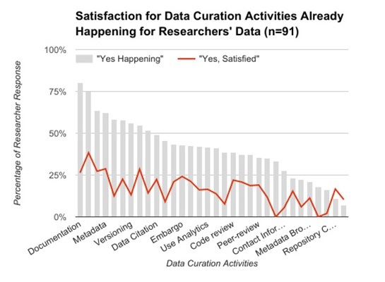
Here is the column chart in question. It displays where data curation actions are happening and overlays people’s satisfaction with that activity. Can you spot the major issue?

I’m really interested in the findings in the chart but I can’t get much actionable information out of it because so few of the columns are labelled (or even fully labelled). Additionally, it’s difficult to match the existing labels to columns due to the diagonal orientation of the text. All this is an artifact of the charting software compressing labels to fit in the allotted space.
The key point I want to make is that label dropping is less likely to happen in a bar chart (right-left bars). It’s usually easier to make a chart taller than to make it wider in order to provide the necessary label space. Plus, the text automatically orients itself in the proper direction so you don’t need to turn your head to read the chart. Overall, this makes for a more readable, more usable chart.
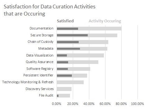
To show the difference, I reproduced a subset of the column chart as a bar chart. I think that it’s much easier to read and take away concrete findings because you can interact with every category in the chart.[1]

So next time you’re making a column chart that needs a lot of labels, I hope you consider using a bar chart instead. It really does make a difference and your readers will appreciate a more readable chart.
[1] There’s an artifact in Excel not letting me use an overlay line as in the original chart but I think the overlapped bars sufficiently demonstrate the original point.


