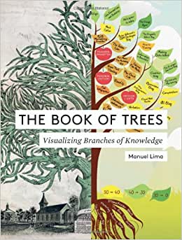
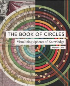
This post is a review of a pair of related books, The Book of Trees: Visualizing Branches of Knowledge and The Book of Circles: Visualizing Spheres of Knowledge, both by Manuel Lima. I ran across these on a list of the best data visualization books and decided to check them out.
I’m reviewing the two books together because they provide parallel showcases of two visualization patterns: trees and circles. In structure and design, the books are obviously related with only the content being different between the two. One book is a collection of hierarchical visualizations and the other a volume full of round visualizations.
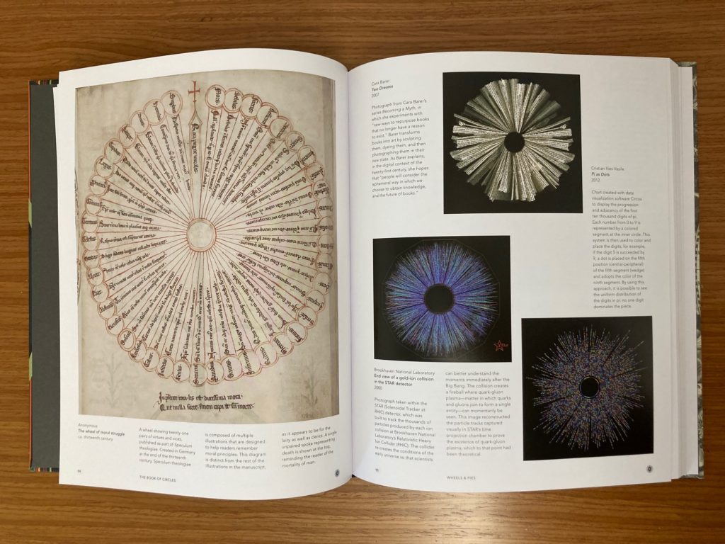
The two books are laid out identically. There is an introductory chapter describing the importance of the tree/circle iconography throughout history, followed by sections containing a wealth of images that are grouped by the author’s tree/circle taxonomies (more on that in a moment). There is no narrative in the latter sections; rather these sections are made up of a huge array of full-color examples from hundreds of years ago through modern day, each with a citation and short description.
The author classifies trees and circles into different structural types, called taxonomies, which both divide the book into discrete sections and help the reader interpret the visualizations. In the tree book, for example, there are sections on figurative trees, horizontal trees, radial trees, and rectangular treemaps, among others, each with its own taxonomic description and wealth of examples. This taxonomic structure provides the reader with a deeper way to engage with the overall visualization pattern and reflect on when one taxonomic structure would be preferable to another.
The timescales spanned by the visualizations in these books are a big part of their appeal. Seeing a diagram from a hand-scribed manuscript next to an AI-generated image reinforces trees and circles as archetypes for structuring information, while also demonstrating the range of styles that can be present within these archetypes. The images themselves visualize all types of information and the only similarity is in the structure of the display.
There are a couple difference between the two books. The circles book is both larger in size and about 50 pages longer. The organization of images also differs between the books; the tree examples are arranged from oldest to newest within taxonomic groups, while the circle examples are grouped by substructure within a taxonomic group with little regard for age. The circles book also veers into art, architecture, and maps, while the tree examples are more traditional data visualizations (though both contain dated attempts to rationalize the world through philosophy). I think I prefer the tree book for two reasons: 1) I’m more likely to visualize hierarchical information, meaning these images are more applicable to my work; and 2) I sometimes find circular visualizations difficult to interpret even though the images are still inspiring.
I’m really happy to have both books in my library alongside other my visualization books. At list prices of $30 (trees) and $40 (circles), they’re nice to have but not critical additions to a visualization collection. If you’re not a visualization or art history nerd, I recommend seeing if your local library has copies if you are looking for visualization inspiration or just some interesting imagery.
Overall, these books balance art, history, and data visualization in beautiful packages. They will not teach you how to visualize nor provide you with examples of the “best” visualizations. Rather, they provide deep views into two visualization families – trees and circles – and inspire you to think deeply about their history and use.