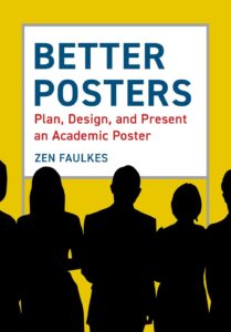
Pelagic Publishing (disclaimer: they published my book “Data Management for Researchers”) asked if I wanted to review their new book, “Better Posters: Plan, Design, and Present an Academic Poster,” and sent me a review copy to read.

As a mid-career librarian and an ex-chemist, I’ve done my share of poster sessions both at library and scientific conferences. Though I’ve always enjoyed conversations during poster sessions, they’ve never been my favorite way of communicating my work. The book “Better Posters: Plan, Design, and Present an Academic Poster” by Dr. Zen Faulkes has me rethinking the value of posters within the scholarly dialog and wanting to make a poster for my next conference.
What impressed me the most about “Better Posters” is its breadth. Not only does the book cover a range of design topics for those creating posters, but it also provides tips for someone attending their first poster session (e.g. how they work and how to make a plan for what to see) and someone organizing a poster session (e.g. providing enough physical space and what poster presenters need to know ahead of the conference). The content for poster designers makes up the majority of the book and covers topics such as: choosing a good title, refining your narrative, working with digital images, picking good fonts, making understandable charts, color theory, layout basics, test printing, and more. Many of these chapters are short (and some of them, like chart design, could be entire books of their own) but Faulkes provides enough material in the context of the scientific poster to lay a solid foundation.
This book makes the case for a streamlined poster style with less text and one central message. This design philosophy underscores the entire book, from picking an easy-to-understand title (a poster is not a TV mystery, so don’t make the reader guess what the point is) to choosing font styles and sizes that are easily readable from 6 feet away. Faulkes also underscores that most people spend only 5 minutes interacting with a poster, so poster designers really need to hone in on the key message and make content as understandable as possible. As Faulkes occasionally reminds us, a poster is not a paper and doesn’t have to tell every detail; he then gives lots of tips for trimming content. That said, the book does not shy away from the unusual, covering: e-posters, interactive paper posters, posters with 3D images, how to handle videos, and various craft projects that can be done with retired posters.
I particularly love the first chapter of the book – all of 3 pages – which gives a set of quick-and-dirty guidelines for making a “perfectly respectable” poster. For the poster creator in a hurry, it’s nice to have some simple guidelines to start from, giving more time to work one’s way through the rest of the book. This type of practical advice carries throughout the book, augmented by touches of humor and an easy-to-read writing style.
I also really like that Faulkes weaves accessibility into topics throughout the book. This includes everything from providing enough space for wheelchairs during a poster session to picking good colors for your poster to making a shared poster file screen-reader friendly. He also acknowledges that poster sessions can be venues for creeps, admonishes attendees to not engage in an array of improper behavior, and suggests ways for a presenter to develop an “exit strategy.”
All of this content is accompanied by a large number of illustrations demonstrating good and bad design, as well as several examples of posters from the author and other scientists. Many of Faulkes’ recommendations have to be visualized to be understood so the full-color illustrations are really essential to conveying the book’s message.
Beyond the content, the books itself runs about 300 pages and is pretty solid in size without being unwieldy. I was particularly impressed by the thick glossy paper which highlights the full-color images and colored headers; the better quality paper is noticeable and really nice. Finally, the publisher lists the price at 30 GB Pounds/42 US Dollars, which puts it on the affordable end of academic books and a great price for such depth of content.
All in all, “Better Posters” aims to be a definitive reference on the academic conference poster, a format that is often overlooked within scholarly communication, and I think it succeeds. You could hand this book to a new graduate student creating their first poster and know that they’ll get a solid foundation in poster design; even practiced poster makers will learn things from this book. This book should be in the library of any university with a graduate program or on the shelf of any researcher who makes research posters/oversees students who make research posters.


