Visualizing COVID in Fiber

A side effect of being a data specialist-by-day and a crafter-by-night, is that the two sometimes combine. This leads to things like the bad passwords dress and the women in science dress, but more recently, I’ve been dabbling in data visualization with fiber. This is my first finished visualization project.
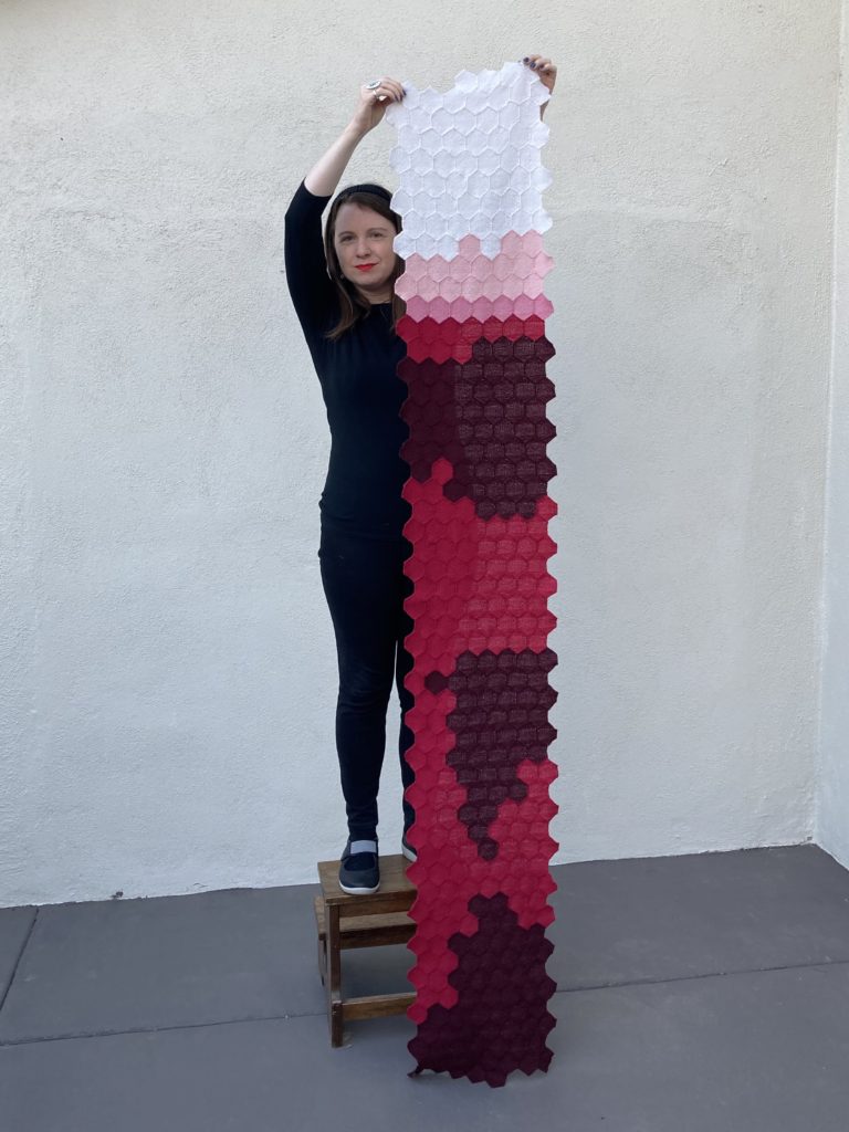
Woman holding a long scarf vertically. Scarf is made up of tiny woven hexagons sewn together. Hexagons in the top are white, then progress through pinks to red. There are three large blotches of dark red within the large red section.

This is a scarf representing the daily U.S. COVID fatalities in 2020. Each 2″ woven hexagon represents the number of reported deaths from COVID on a single day in the United States, starting on January 1, 2020 and ending December 31, 2020.

To interpret the visualization, you need to know how the data is laid out and what the colors mean. Data is laid out by week exactly as it appears on the calendar, with each week starting on Sunday and ending on Saturday. I represented the number of deaths on a logarithmic scale by color, where:

  • white = 0 deaths
  • light pink = 1-9 deaths
  • dark pink = 10-99 deaths
  • red = 100-999 deaths
  • dark red = 1000+ deaths

The data was pulled from The COVID Tracking Project at The Atlantic and used under a Creative Commons CC BY 4.0 license. https://covidtracking.com/

For those interested in the crafting part of the project, I wove the hexagons on a 2-inch, fine-sett turtle pin loom using KnitPicks Palette yarn. Full crafting details are available on this Ravelry page.

Small hexagon pin loom, half woven on top and bottom with red yarn.

I don’t think we, as a society, have entirely processed the half million deaths (and counting) from this pandemic. This visualization was one way for me work through the massive loss. It was very surreal to weave a dark red hexagon and realize that it represented over 1,000 people on one day. And then acknowledge that there are over 150 dark red hexagons on the scarf.

For me, this visualization also represents imperfection and I embrace that. Color-coding on a log scale distorts the numbers but was a necessary trade off to limit yarn colors. I also see artifacts in the data, especially in August and November, where deaths are reported in lower numbers on Sundays and Mondays. Perhaps most importantly, I recognize that these numbers only represent reported deaths, so are not an accurate picture of the total loss from COVID. Nor do the numbers show impacts we all feel from that loss.
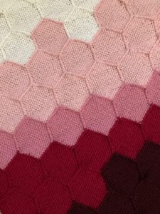
Close up of woven hexagons, showing all five colors used in the data visualization. This is data from around March 2020.

I don’t know if I’ll do a second half of this scarf representing 2021. But I will say that it’s my fervent wish that that visualization would be made up of mostly white hexagons. Until then, wear a mask, keep your distance, and get vaccinated when you are able to.
Posted in dataVisualization | 2 Comments

New NIH Data Management and Sharing Policy

The thud you might have heard yesterday was NIH dropping a new Data Management and Sharing Policy. It won’t go into effect until 2023-01-25 but the policy has so many ramifications that I don’t plan to waste time in preparing.

I’m going to do a short overview of initial thoughts here. I expect that I’ll be working through all of the nuances more in the weeks to come.

Here are the highlights for how this policy effects researchers:

  • All NIH grants will be required to have a 2-page maximum data management plan (DMP). NIH expects researchers to: be clear in the DMP about where they plan to share (“to be determined” is no longer acceptable), notify them if plans change, and actually follow the plan.
  • You will be sharing more data, as NIH not only wants the data that underlies publications but all data that verifies results.
  • You will be sharing data sooner. NIH prefers if you share as soon as possible, but at the latest sharing should occur with publication or at the end of the grant period, which ever comes first. That last part is a huge change.
  • You will share your data in a repository. Criteria for data repositories are provided in a supplement and I expect to see more in this area between now and 2023.
  • You can ask for money to support data management and sharing activities, including pre-paying for long-term hosting of open data.
  • If you conduct data on people, sharing expectations are changing. NIH really wants researchers to fine-tune the balance between sharing and privacy. Two mechanisms explicitly called out are outlining sharing practices during informed consent and controlled data sharing, even for de-identified data. This is another area where I want to see more development.
  • If you are doing research on indigenous populations, you must respect Tribal sovereignty. This is a great addition to the policy.

I think this is a good policy, though it’s definitely overdue. I don’t love the lack of clarity around retention times and I’m not sure how I feel about review of DMPs shifting from peer reviewers to program officers. But these are minor quibbles in what I think is a pretty solid policy.

The biggest takeaways is that this policy represents a shift in expectations for data sharing. It has stronger requirements than the NSF data policy and will really move things forward. Some people are going to hate it and it’s going to be a big adjustment, but it’s a win for reproducibility and open data.

Posted in dataManagementPlans, fundingAgencies | 1 Comment

Foundational Practices of Research Data Management

If you’re a regular reader of my blog, you’ll know that one of my goals is for all researchers to adopt the basic data management practices that make conducting research easier. I’ve written a whole book on data management, done videos, created checklists, written numerous blog posts, etc., but it will never be enough until researchers are regularly taught these skills. Until that point, I’ll keep sending the gospel of data out in the world in different formats, hoping to reach new audiences.

My latest iteration of educating about the principles of data management is in the form of a research article in RIO. I really like the article format because it’s just enough space to provide a broad overview of the basic data management practices. And if readers want to learn more, we’ve provided a handy list of citations!

The new article covers 10 practices of data management that my coauthors and I consider to be foundational:

  • Practice 1: Keep sufficient documentation
  • Practice 2: Organize files and name them consistently
  • Practice 3: Version the Files
  • Practice 4: Create a security plan, when applicable
  • Practice 5: Define roles and responsibilities
  • Practice 6: Back up the data
  • Practice 7: Identify tool constraints
  • Practice 8: Close out the project
  • Practice 9: Put the data in a repository
  • Practice 10: Write these conventions down [in a data management plan]

This is by no means the complete scope of data management but rather a good introduction. Honestly, if you implement all ten practices into your research, you’re going to be doing very well with your data.

So if you or a peer are looking for a general introduction to research data management, check out my new article “Foundational Practices of Research Data Management.”

Citation: Briney KA, Coates H, Goben A (2020) Foundational Practices of Research Data Management. Research Ideas and Outcomes 6: e56508. https://doi.org/10.3897/rio.6.e56508

Posted in dataManagement | Leave a comment

Book Review: How Charts Lie

How Charts Lie cover image

Continuing in my pandemic reading of data books, next up is “How Charts Lie: Getting Smarter about Visual Information” by Alberto Cairo. (I didn’t plan to be a predominately book review blog, but I need a way to channel the pandemic anxiety, so here we are.)

This book is a little different than other visualization books I’ve been reading because it focuses on visual literacy (which Cairo calls “graphicacy”) instead of chart design. Because charts appear by their nature more authoritative (they show “facts” and make such information easy to understand), we need to train ourselves to critically assess the information displayed. This book provides the framework for an individual to engage with and dissect the charts we regularly see in the news and on social media and decide what’s accurate.

Cairo uses his experience as a chart designer and chart consumer to break down the major ways that charts lie. Each type of lie gets covered in its own chapter in the book:

  • Poor design
  • Displaying dubious data
  • Displaying insufficient data
  • Concealing or confusing uncertainty
  • Suggesting misleading patterns

You’ll notice that these mistakes aren’t all about chart design; many chart issues concern the data that’s being visualized, including everything from displaying percentages instead of absolute numbers on a map to vetting data sources. Cairo provides ways to think through the many mistakes that are made in data selection, because even the prettiest and easiest-to-read chart can lie to us by getting the data wrong .

What’s nice about the book is that it doesn’t assume that charts are intentionally lying to us. Sometimes designers make honest mistakes and sometimes trade-offs have to be made. Cairo walks the reader through exemplar visualizations and shows us how different choices affect the accuracy and design of the chart. By discussing the data selection and visualization decision process as well as showing how these choices affect the final design, Cairo provides the reader with the mental scaffolding to critically assess charts.

As with any data book, Cairo uses plenty of examples throughout this book. What I found interesting is how many of these examples were drawn from recent politics; the book actually starts by dissecting a graphic that Donald Trump shared in April 2017. While I appreciate the American cultural touchstones (and it’s nice to rage at some of the bad charts we’ve seen in recent years), I do worry that this book will lose some of its relevance over time.

Overall, this is a good book for any information consumer to read and will also help visualization designers learn to avoid pitfalls and assess design trade-offs. I would also recommend it to my fellow librarians who do information literacy instruction; the visual literacy discussed in this book is a perfect compliment to the work we’re already doing with students around assessing text-based resources.

Posted in bookReview, dataVisualization | Leave a comment