Book Review: The Book of Trees & The Book of Circles

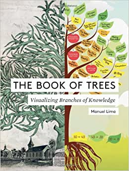
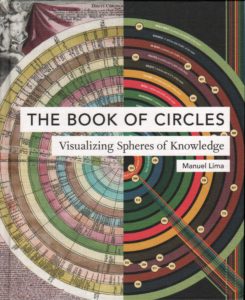
This post is a review of a pair of related books, The Book of Trees: Visualizing Branches of Knowledge and The Book of Circles: Visualizing Spheres of Knowledge, both by Manuel Lima. I ran across these on a list of the best data visualization books and decided to check them out.

I’m reviewing the two books together because they provide parallel showcases of two visualization patterns: trees and circles. In structure and design, the books are obviously related with only the content being different between the two. One book is a collection of hierarchical visualizations and the other a volume full of round visualizations.
The two books are laid out identically. There is an introductory chapter describing the importance of the tree/circle iconography throughout history, followed by sections containing a wealth of images that are grouped by the author’s tree/circle taxonomies (more on that in a moment). There is no narrative in the latter sections; rather these sections are made up of a huge array of full-color examples from hundreds of years ago through modern day, each with a citation and short description.

The author classifies trees and circles into different structural types, called taxonomies, which both divide the book into discrete sections and help the reader interpret the visualizations. In the tree book, for example, there are sections on figurative trees, horizontal trees, radial trees, and rectangular treemaps, among others, each with its own taxonomic description and wealth of examples. This taxonomic structure provides the reader with a deeper way to engage with the overall visualization pattern and reflect on when one taxonomic structure would be preferable to another.

The timescales spanned by the visualizations in these books are a big part of their appeal. Seeing a diagram from a hand-scribed manuscript next to an AI-generated image reinforces trees and circles as archetypes for structuring information, while also demonstrating the range of styles that can be present within these archetypes. The images themselves visualize all types of information and the only similarity is in the structure of the display.
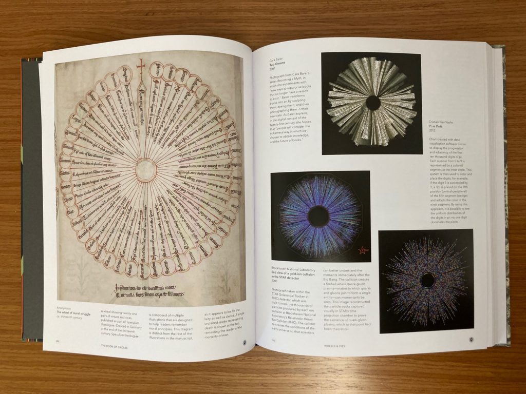
Examples from The Book of Circles of wheel and pie diagrams: a wheel of moral struggle from the 13th century (left), book artwork from 2007 (top), gold-ion collision data from Brookhaven National Lab (bottom middle), and a visualization of pi from 2012 (bottom right).

There are a couple difference between the two books. The circles book is both larger in size and about 50 pages longer. The organization of images also differs between the books; the tree examples are arranged from oldest to newest within taxonomic groups, while the circle examples are grouped by substructure within a taxonomic group with little regard for age. The circles book also veers into art, architecture, and maps, while the tree examples are more traditional data visualizations (though both contain dated attempts to rationalize the world through philosophy). I think I prefer the tree book for two reasons: 1) I’m more likely to visualize hierarchical information, meaning these images are more applicable to my work; and 2) I sometimes find circular visualizations difficult to interpret even though the images are still inspiring.

I’m really happy to have both books in my library alongside other my visualization books. At list prices of $30 (trees) and $40 (circles), they’re nice to have but not critical additions to a visualization collection. If you’re not a visualization or art history nerd, I recommend seeing if your local library has copies if you are looking for visualization inspiration or just some interesting imagery.

Overall, these books balance art, history, and data visualization in beautiful packages. They will not teach you how to visualize nor provide you with examples of the “best” visualizations. Rather, they provide deep views into two visualization families – trees and circles – and inspire you to think deeply about their history and use.

Posted in bookReview, dataVisualization | Leave a comment

Life in the Time of COVID

Year 3 of this pandemic is quickly approaching and one might think we’d be getting used to being in these “unprecedented times.” And yet the last several months have been extra challenging for me, particularly as a parent of small children (one of whom cannot be vaccinated yet). So this blog has been silent as my focus has been simply to get through the weeks with everyone being healthy and safe.

The good news is that I have a bunch of new stuff to talk about in 2022, including my second book which will be published this summer! I’ll write about everything in future posts, but for now I want to circle back to my handwoven COVID visualization from last year.

In January 2022 I wrote up a post for the Data Visualization Society’s blog, the Nightingale, that goes beyond the mechanics of the visualization to discuss how central my emotions and my anxiety were to creating my 2020 COVID visualization. With a little distance between finishing the visualization and now, it became clear to me that having an outlet for my pandemic-induced feelings was a critical, if yet untold, part of the visualization. I’m glad to finally be able to put into words what was originally only subconscious thoughts.

As a result of my post with the Nightingale, I was invited to participate in the COVID Calls podcast, which I’m sharing here:

In addition to discussing the visualization, I also share some of my thoughts as a science librarian and show off a couple hexagons from the 2021 edition of the visualization. Expect the 2021 visualization to appear on the blog later this year once I finally finish it.

That’s what I have for now: I’m still here and will be back with more exciting content soon.

Posted in admin, dataVisualization, video | Leave a comment

Book Review: Better Posters

Pelagic Publishing (disclaimer: they published my book “Data Management for Researchers”) asked if I wanted to review their new book, “Better Posters: Plan, Design, and Present an Academic Poster,” and sent me a review copy to read.

Cover of book "Better Posters: Plan, Design, and Present an Academic Poster"

As a mid-career librarian and an ex-chemist, I’ve done my share of poster sessions both at library and scientific conferences. Though I’ve always enjoyed conversations during poster sessions, they’ve never been my favorite way of communicating my work. The book “Better Posters: Plan, Design, and Present an Academic Poster” by Dr. Zen Faulkes has me rethinking the value of posters within the scholarly dialog and wanting to make a poster for my next conference.

What impressed me the most about “Better Posters” is its breadth. Not only does the book cover a range of design topics for those creating posters, but it also provides tips for someone attending their first poster session (e.g. how they work and how to make a plan for what to see) and someone organizing a poster session (e.g. providing enough physical space and what poster presenters need to know ahead of the conference). The content for poster designers makes up the majority of the book and covers topics such as: choosing a good title, refining your narrative, working with digital images, picking good fonts, making understandable charts, color theory, layout basics, test printing, and more. Many of these chapters are short (and some of them, like chart design, could be entire books of their own) but Faulkes provides enough material in the context of the scientific poster to lay a solid foundation.

This book makes the case for a streamlined poster style with less text and one central message. This design philosophy underscores the entire book, from picking an easy-to-understand title (a poster is not a TV mystery, so don’t make the reader guess what the point is) to choosing font styles and sizes that are easily readable from 6 feet away. Faulkes also underscores that most people spend only 5 minutes interacting with a poster, so poster designers really need to hone in on the key message and make content as understandable as possible. As Faulkes occasionally reminds us, a poster is not a paper and doesn’t have to tell every detail; he then gives lots of tips for trimming content. That said, the book does not shy away from the unusual, covering: e-posters, interactive paper posters, posters with 3D images, how to handle videos, and various craft projects that can be done with retired posters.

I particularly love the first chapter of the book – all of 3 pages – which gives a set of quick-and-dirty guidelines for making a “perfectly respectable” poster. For the poster creator in a hurry, it’s nice to have some simple guidelines to start from, giving more time to work one’s way through the rest of the book. This type of practical advice carries throughout the book, augmented by touches of humor and an easy-to-read writing style.

I also really like that Faulkes weaves accessibility into topics throughout the book. This includes everything from providing enough space for wheelchairs during a poster session to picking good colors for your poster to making a shared poster file screen-reader friendly. He also acknowledges that poster sessions can be venues for creeps, admonishes attendees to not engage in an array of improper behavior, and suggests ways for a presenter to develop an “exit strategy.”

All of this content is accompanied by a large number of illustrations demonstrating good and bad design, as well as several examples of posters from the author and other scientists. Many of Faulkes’ recommendations have to be visualized to be understood so the full-color illustrations are really essential to conveying the book’s message.

Beyond the content, the books itself runs about 300 pages and is pretty solid in size without being unwieldy. I was particularly impressed by the thick glossy paper which highlights the full-color images and colored headers; the better quality paper is noticeable and really nice. Finally, the publisher lists the price at 30 GB Pounds/42 US Dollars, which puts it on the affordable end of academic books and a great price for such depth of content.

All in all, “Better Posters” aims to be a definitive reference on the academic conference poster, a format that is often overlooked within scholarly communication, and I think it succeeds. You could hand this book to a new graduate student creating their first poster and know that they’ll get a solid foundation in poster design; even practiced poster makers will learn things from this book. This book should be in the library of any university with a graduate program or on the shelf of any researcher who makes research posters/oversees students who make research posters.

Posted in bookReview | Leave a comment

The White Supremacy of Library Learning Analytics

I’ve removed this post because it is problematic. I want to thank my colleagues of color for pointing this out to me and educating me.

  • It is a privilege to not see white supremacy in learning analytics research.
  • I jumped into an ongoing conversation without recognizing the work of peers, mostly people of color, who are already working in this area. Just because ideas are new to me does not mean that they are new. (I’ll point you to the work of Yasmeen Shorish if you want to learn more.)
  • I posted something that needed further reflection because I got excited to put something on my blog. Essentially, I tried to get a cookie when no cookies were deserved.

Thank you again to those willing to take time to educate me. I will work to be more thoughtful in the future.

Posted in libraries, socialJustice | Leave a comment

Thoughts on Data Management as Housekeeping

My colleague Carolyn Bishoff at the MDLS20 conference introduced me to the idea that data management is like housekeeping: it’s a task that you have to continually do in order to live and thrive in your environment. It’s not something that we always enjoy doing and it’s something that we can get away with doing the bare minimum in order to survive, but it’s still something that needs to be done.

Carolyn continued this metaphor in the scope of teaching people how to do data management (which is something I do as part of my job). She likened it to teaching someone to do laundry; just because you know how to wash and fold your clothes doesn’t mean that you actually get your laundry done. I think this is a good reminder for everyone, data management instructors and practitioners alike, about the continual nature of the work and that knowing doesn’t necessarily translate into doing.

I’m also reflecting on another talk by my colleague Hannah Gunderman at the RDAP21 conference who acknowledged how much anxiety exists around data management. When we talk about “data best practices” (which I’ve done frequently), that can create anxiety because we feel like we aren’t living up to that ideal data standard. Instead, Gunderman suggested using the term “recommended practices” and recognizing that the perceived ideal is impossible. We might desire to be the Martha Stewart of data management (I will admit to personally having this desire), but it’s not a realistic standard for everyday life.

A third reference I want to pull into this reflection is from the book Unf*ck Your Habitat by Rachel Hoffman. It’s a book about literal housekeeping but I think some of the lessons apply to data management. Namely, Hoffman recommends that, instead of doing deep cleaning sprees when your house gets super messy, you should regularly set aside small amounts of dedicated time (with the duration depending on your energy and ability) to try to improve your environment. This can be 5 minutes or 30 minutes, but when that time’s up you stop cleaning and take a short break. You won’t be able to clean everything during these short periods but you can actually make a positive difference in this short amount of time. This incremental method gives us the ability to make improvements while also relieving ourselves of the need for housekeeping perfection.

Finally, I’m thinking about housekeeping as care work, which is often invisible and gendered. If we use this metaphor, we need to recognize that housekeeping labor has mainly been the provenance of women in American society (and other Western countries) and historically undervalued. It’s unpaid labor and, even though it’s critical to a functioning society, it’s made invisible (see Abigail Goben’s Women’s Labor in COVID bibliography for all of the ways our reliance on unpaid care labor has broken us during this pandemic). I think data management is a form of care work, in that we are caring for our research results, yet the act of managing data is often rendered invisible until a data disaster happens. This perspective also makes me wonder if data management is a gendered act within the research enterprise?

While metaphors always have their limitations, I think there is value in thinking of data management as housekeeping. There’s no one right way to keep your house clean and there’s no one right way to keep your data organized, but there’s value in making continual small steps to make things better. Embrace the imperfection and do what you can to make your data a little more organized that before; these small differences really do help. And finally, as a collective we must value the work of data management, even when there’s societal pressure to render it invisible.

Posted in dataManagement | Leave a comment

Citation Omitted: A Story of Re-identification

I published the article “Data Management Practices in Academic Library Learning Analytics: A Critical Review” in 2019. Eagle-eyed readers may have noticed that I omitted a couple of citations, instead listing them as “citation omitted in order to protect students’ identities.” This is because the two studies in question published student details so identifying that it would be possible to attach names to those individuals. Of the two studies, one was incidentally identifying and one was egregiously identifying. This blog post will talk about the egregious study, this study:

Murray, A., Ireland, A., & Hackathorn, J. (2016). The Value of Academic Libraries: Library Services as a Predictor of Student Retention. College & Research Libraries, 77(5), 631–642. https://doi.org/10.5860/crl.77.5.631

I had not publicly identified the study until January 6 of this year when, in my frustration about CR&L publishing yet another study with privacy concerns and the simultaneous unfolding of American democracy, I vented out this Twitter rant:

Then, to properly explain my concerns about privacy and re-identification in the article, I followed up with this Twitter thread:

I’ve had several requests to turn those two Twitter threads into a citeable blog post, so here we are.

I have two privacy concerns with the study. My major concern centers on Table 1, which lists study participants to include: 2 Native American freshman, 3 Native American sophomores, 1 Pacific Islander freshman, and 1 Pacific Islander sophomore. The study also lists age range of participants from 17 to 83, meaning the oldest participant is 83 years old. By including this specific information, the article basically identified several students even without giving us their names.

In research this is called “n=1”, meaning that you’ve divided up demographics so much that you identify single people. It’s definitely not something that should be done when publishing research results. The individuals in this example are even more identifiable as they come from minority student populations (with examples of both race and age minorities), so it’s bad on two fronts.

If I was a part of the university where the study was conducted, just knowing “83 year-old student” or “Pacific Islander sophomore” may be enough for me to come up with specific names because I’m familiar with the student body. As an outsider, it’s still a rather trivial process to go from n=1 identifiers to names.

Let’s take the “Pacific Islander sophomore” and work through the thought example (I’m not actually going to find a name, just talk about the process). We’ll pull in an outside dataset to make this work, in this case IPEDS. IPEDS in a national database that collects statistics on every U.S. academic institution. One of the statistics IPEDS collects is completions by year in different majors broken down by racial demographics, aka. the “Completions” table. So now I can look up the university, look up the year, and find my single Pacific Islander to discover their major. Then it becomes a matter of visiting the department webpage or Facebook or the graduation program to get a list of names corresponding to that major in that year. Finally, using context and other available data I can whittle the names down to a likely candidate. The person’s minority status makes them easier to identify here, especially if they have a non-White name or do not pass for White in departmental photos. This whole process may take 30 minutes or so and uses information that is freely available on the web.

Coming back to the study, while putting a name to a study participant does not tell me what that student did in the library, it’s still not acceptable for the article to identify them. And it’s not okay that these issues slipped past peer reviewers and editors. And, when I contacted the editor about correcting the issue, it’s not okay that nothing was done (the conclusion was basically “it’s bad but not bad enough to merit correction”).

So, seeing as this is a blog on better data practices, what should be done instead? Whenever you have small populations, think carefully before you report data about those people. There’s no hard rule of thumb for size but consider: warnings at under 20, red flags at less than 10, and full stop for under 5. There are two common options for dealing with small populations: aggregate small subgroups into one “Other” group to add up small numbers into a larger number (e.g. there are 33 Asian, Native American, and Pacific Islanders in this study); or obscure the small/outlier number values (e.g. “<5 Pacific Islanders” or “>65 years old”). Be aware that the first option can hide the existence of minority racial populations by erasing their representation in the data, so be thoughtful to balance representation with privacy.

The second thing that needs to be done is that we all need to be better at identifying and calling out these problems when we see them, especially peer reviewers and editors. I know I get on my soapbox periodically about “anonymization” versus “de-identification”, but it’s because many people fundamentally don’t understand the difference. We need to learn that datasets about people are never anonymous and that we should always operate from the perspective that they can be re-identified.

Finally, I won’t deny that there are a lot of power dynamics in play for why I haven’t told this story previously. I didn’t want to identify the article, and thereby identify the students, as the students have no power in this situation and didn’t ask to be identified just because they used the library. I was also leery, as a somewhat new librarian, of calling out one of the field’s preeminent journals. I have now done both because it’s important for people to understand just how easy it is to re-identify people from scant published information. I do this not to rehash the past but because I want people to do better going forward. So go, do better, and never publish n=1 again.

Thank you Dorothea and Callan and everyone else who suggested that this be a blog post.

Posted in libraries, privacy, publishing | Leave a comment