Researchers tend to think about data management at key times during a project, such as when writing a data management plan for grant funding and when preparing for data collection. But there’s one other critical time for data management in the project lifecycle: when a project ends and/or a researcher leaves the project.
I’ve actually blogged about project close out twice before (here and here) because it’s an area where I’ve had my own successes and failures. I’ve lost data in projects where I didn’t do data close out and have saved myself several large headaches on projects where I did close out. But here’s the important thing: project close out isn’t actually that difficult, it’s just that there is hardly any guidance on how to do it.
Enter the “Project Close Out Checklist for Research Data“! Born out of a discussion with Jonathan Petters and Abigail Goben at the RDAP Summit in 2020, this checklist describes a range of activities for helping ensure that research data are properly managed at the end of a project. Activities include: making stewardship decisions, preparing files for archiving, sharing data, and setting aside important files in a “FINAL” folder.
Two versions of the checklist are available: a Caltech Library branded version and a generic editable version. I’m sharing the checklist under a CC BY license, so please reuse and remix with attribution.
My hope is that this checklist will help researchers be able to use their data well into the future!
It’s always nice to have new publications to put up on the blog, especially when they’re all things I’ve been working on for at least a year. If you’re interested in privacy and data and libraries, I hope you check them out!
Briney, Kristin, Becky Yoose, John Mark Ockerbloom, and Shea Swauger. “A Practical Guide to Performing a Library User Data Risk Assessment in Library-Built Systems.” Digital Library Federation, May 2020. http://doi.org/10.17605/OSF.IO/V2C3M.
Libraries collect data about the people they serve every day. While some data collection is necessary to provide services, responsible data management is essential to protect the privacy of our users and uphold our professional values. One of the ways to ensure responsible data management is to perform a Data Risk Assessment. A Data Risk Assessment is a process of identifying data the library collects about users, understanding how it manages that data, identifying the risks associated with that data, and then selecting an appropriate risk mitigation strategy.
Jones, K. M. L., Asher, A., Goben, A., Perry, M. R., Salo, D., Briney, K. A., & Robertshaw, M. B. (forthcoming). “We’re being tracked at all times”: Student perspectives of their privacy in relation to learning analytics in higher education. Journal of the Association for Information Science and Technology. https://doi.org/10.1002/asi.24358
Higher education institutions are continuing to develop their capacity for learning analytics (LA), which is a sociotechnical data‐mining and analytic practice. Institutions rarely inform their students about LA practices, and there exist significant privacy concerns. Without a clear student voice in the design of LA, institutions put themselves in an ethical gray area. To help fill this gap in practice and add to the growing literature on students’ privacy perspectives, this study reports findings from over 100 interviews with undergraduate students at eight U.S. higher education institutions. Findings demonstrate that students lacked awareness of educational data‐mining and analytic practices, as well as the data on which they rely. Students see potential in LA, but they presented nuanced arguments about when and with whom data should be shared; they also expressed why informed consent was valuable and necessary. The study uncovered perspectives on institutional trust that were heretofore unknown, as well as what actions might violate that trust. Institutions must balance their desire to implement LA with their obligation to educate students about their analytic practices and treat them as partners in the design of analytic strategies reliant on student data in order to protect their intellectual privacy.
Jones, K. M. L., Briney, K. A., Goben, A., Salo, D., Asher, A., & Perry, M. R. (2020). A comprehensive primer to library learning analytics practices, initiatives, and privacy issues. College & Research Libraries, 81(3), 570–591. https://doi.org/10.5860/crl.81.3.570
Universities are pursuing learning analytics practices to improve returns from their investments, develop behavioral and academic interventions to improve student success, and address political and financial pressures. Academic libraries are additionally undertaking learning analytics to demonstrate value to stakeholders, assess learning gains from instruction, and analyze student-library usage, et cetera. The adoption of these techniques leads to many professional ethics issues and practical concerns related to privacy. In this narrative literature review, we provide a foundational background in the field of learning analytics, library adoption of these practices, and identify ethical and practical privacy issues.
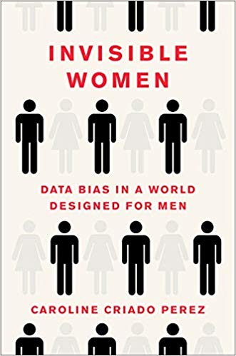
The book, Invisible Women: Data Bias in a World Designed for Men, is one of those books that I’m going to shove toward my unsuspecting friends and say “read this!”, it’s so good. It’s validating for women, will be eye-opening for men, and a vital read for everyone, particularly creators and consumers of data.
Invisible Women takes a critical look at the world where male (often white male) is the default and the harm this does to the female half of the population. It’s a data book because it’s entire thesis centers on data (here gender-disaggregated data), but it’s not a data book where you’ll find data actually analyzed. Rather, author Caroline Criado Perez argues that everything from economic policy to the design of cell phones is biased against women because data is either: not collected on women, not disaggregated by sex, or ignored when female-specific data actually exists. She collectively labels these problems as “the gender data gap.”
This book is incredibly well researched across a huge range of topics. Criado Perez covers everything from transit systems to unpaid labor to car safety design and cites experts, studies, and data (when it actually exists). The chapter on the gender data gap in medicine is particularly staggering. Taken together, her detailed research paints a stark picture of how broadly women are excluded from decision making at all levels.
What I particularly appreciate about Invisible Women is that Criado Perez moves beyond the litany of depressing facts and shows how better data collection and analysis can actually improve women’s lives. Then she cites real world examples of this occurring. By modeling how the experience should be instead of solely focusing on how depressing the situation currently is, Criado Perez demonstrates that designing with women’s needs in mind is both feasible and broadly beneficial to society.
The one deficiency of the book is that I consistently found myself wanting a broader acknowledgement that the gender data gap is compounded by race, disability, etc. Criado Perez cites a couple examples (U.S. maternity mortality in black women and the exclusion of U.S. black women in Hurricane Katrina recovery efforts) but overall falls short in this area. I understand that the book’s focus was on women and that this data gap is likely easiest to identify, since women represent a full half of the human population. That said, the strength of the data-gap argument is missing something essential when we fail to acknowledge that other data gaps exist and intersect with the gender data gap.
Overall, this book is fantastic and a necessary read for those who do any work in the data sphere. For those who aren’t data nerds, Criado Perez’s endless stream of facts is lightened by data success stories and a witty writing style, making this book accessible and enjoyable. I personally enjoyed the audiobook, which is read by the author herself. No matter the format, Invisible Women delivers critical facts on an important topic and is a highly recommended read.
One of my recent posts touched how powerful R is for data cleaning and manipulation, but I want to take a step back and recognize that a ton of science gets done in Excel. And while Excel has many limitations (cough dates cough), it does have a place in the research toolkit. So it’s worth discussing some of the more powerful features of the software to get the most out of using it.
In this post, we’re going to talk about a useful feature in Excel that not everyone knows about: pivot tables. If you’re already using pivot tables, you can skip this post entirely and go have a cup of tea instead. But for everyone else, let me blow your mind.
If you know how to write functions in Excel, you know that Excel can easily calculate sums, averages, and counts across all values for one variable in a dataset. What’s more difficult to do is segment that variable into subgroups and calculate sums, average, and counts for each distinct subset. This is where pivot tables come in.
For example, say I did a survey on college students where one variable in my dataset lists year in school (a text value) and another variable contains Likert scale data (a 1-5 integer rating value). I want to know how many freshman, sophomores, juniors, and seniors there are in the dataset. A pivot table can do that. Another example would be calculating average Likert response value for each year-in-school. Or create a simple table with year-in-school as the rows, Likert value as the columns, and counts of responses as the table entries. Pivot tables can do these too. Basically, any time you want to group your data into subsets and run some simple summary statistics on those subsets, you want a pivot table.
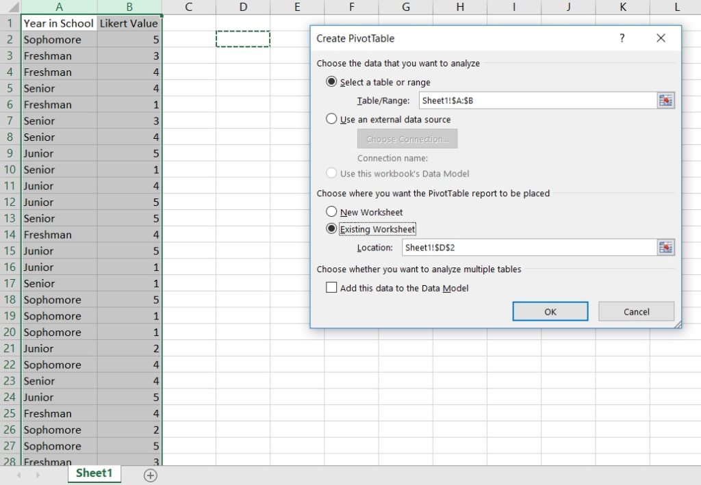
The nice thing about Excel is that it has a little wizard for making pivot tables that, with practice, is fairly straightforward to use. (Note: I’m working in Excel 2016.) To get started, highlight the data you want to analyze, click “Insert/PivotTable”, and select where you want to put your data.
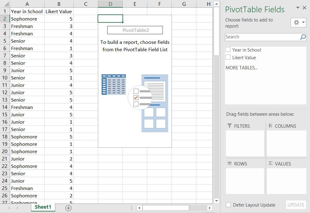
Doing this drops in an empty pivot table and opens the PivotTable wizard.
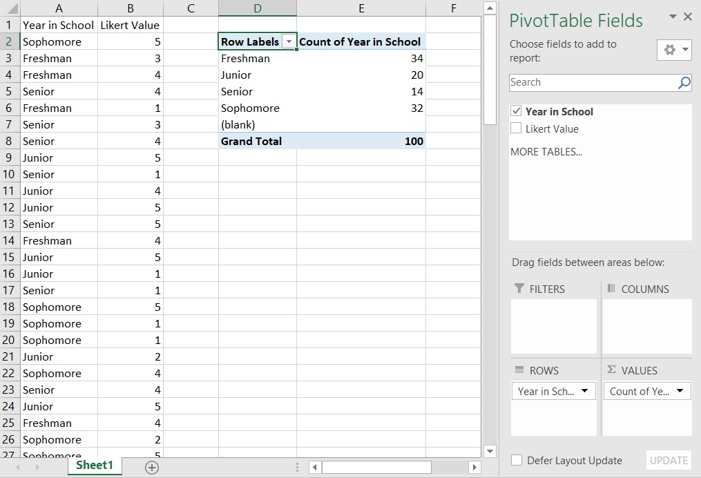
Let’s start with the example of getting counts of how many freshman, sophomores, juniors, and seniors there are in the dataset. Drag-and-drop the “Year in School” label from the top of the wizard (under “PivotTable Fields”) down to the “Rows” box at the bottom of the wizard; this will put a list of years into your pivot table but no data. Next drag the “Year in School” label from the top into the “Values” box at the bottom right of the wizard; this will add values to your table. Note that the standard Value defaults to count. Now you have the table you need!
[Exercise: how would you create a table displaying how many times the Likert values 1-5 appear in your dataset?]
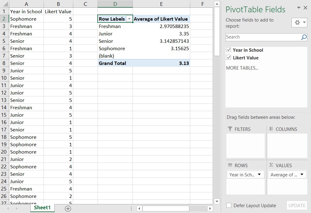
In the next example, we’ll look at average Likert value by year-in-school. To remove the current count data, you can either: make a new pivot table, drag-and-drop variables out of the “Values” box, or click the arrow next to a variable in the “Values” box and select “Remove Field”. With “Year in School” in the “Rows” box, drag-and-drop “Likert Value” into the “Values” box. Again, the default is count, which isn’t what we want here. Click the arrow next to “Count of Likert Value” in the “Values” box and select “Value Field Settings…”; this opens up a menu where you can select different functions, one of which is “Average”. Change to average and now you have a table of Likert averages displayed by year-in-school!
[Exercise: how would you calculate standard deviation of Likert values for each year-in-school? Can you display both average and standard deviation in the same table?]
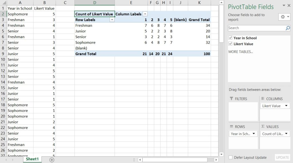
Our final example will add columns to our table. Reset your table. Drag-and-drop “Year in School” to the “Rows” box in the wizard and “Likert Value” into the “Columns” box. Drag “Likert Value” into the “Values” to populate the count data. And now we have our table of response counts broken down by both year-in-school and Likert value. The pivot table also shows totals across both rows and columns, which is a handy check to see if the data looks right.
[Exercise: how would you re-arrange this table to show year-in-school as columns and Likert value as rows? Does this change the calculated counts?]
I’ll let you all play around with the PivotTable wizard further, but know that you can:
Filter your data to display only certain variable values (e.g. freshman and sophomores only)
Resort your table by data value (e.g. highest response counts are at the top of the table)
Do different calculations besides average and count
Create figures directly from pivot table data
Pivot tables are very powerful!
If you’ve never used pivot tables before, I hope this post shows you how useful they are and gives you enough information to get started making pivot tables of your own.
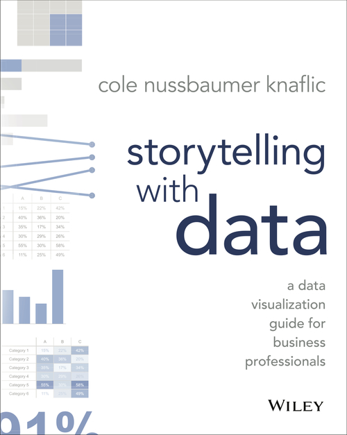
One of the data areas that I’m currently interested in is data visualization, which has resulted in a pile of data viz books in my to-read list. I’ve been working my way through Show Me the Numbers, which may be a future book review, but got interrupted when the ebook for Storytelling With Data came available at the public library. It was a quick and enjoyable read and worth sharing with you!
Storytelling with Data is a useful overview on the best ways to use data to support whatever argument you’re making. In one sense it’s a data visualization book, but it also takes a larger view of how your data visualizations support the story you’re telling. Nussbaumer Knaflic does this through 6 lessons:
Understand the context
Choose an appropriate visual display
Eliminate clutter
Focus attention where you want it
Think like a designer
Tell a story
You can see from the lessons (chapters) that, while visualization practices make up the core of the book, everything is bookended by putting visualizations into the larger context of the message you are trying to convey.
What I like about this book is that it’s an accessible way to orient yourself to a number of design principles. It provides a framework for rethinking how you approach visualization and sets you on a path toward engaging with visuals in a new way. The storytelling aspect of the book is particularly helpful, and Nussbaumer Knaflic cites guides to effective presentations to underscore her points.
The downside of the book’s accessibility is that I found myself wishing to engage with a number of the ideas presented in the book at a deeper level. Nussbaumer Knaflic gives some advice on how to chose the proper graph format, but I found Stephanie Evergreen’s Effective Data Visualization (my review here) to be much more helpful here. Similarly, Storytelling with Data summarizes cognitive load and the Gestalt principles of visualization, but Stephen Few’s Show Me the Numbers goes into these in more depth to the point where I feel that Few allows me to actually apply these concepts to my visualizations.
In summary, I would definitely share Storytelling with Data to someone looking to get started with improving their data visualizations as it provides a good foundation to the topic. More experienced visualizers may also find useful information in the book’s pages.
I’m putting my librarian hat on for today’s post as we’re looking at citation managers. There’s a lot to love about this type of software (easy citation formatting!!!) but in essence, they’re a tool for managing a specific type of data: literature.
Thinking about citation management as a data management issue, we can start applying some of the principles of the latter to the former.
Choosing a tool There are lots of great citation managers out there and they all perform in roughly the same ways. As citations can be exported and imported, you won’t be locked into any one platform, so I would pick something that fits in your research workflow. Popular options include Zotero, Mendeley, and EndNote; if I had to recommend one, I would opt for Zotero due to its open platform.
Organization Like any other data, organizing your citations will help you later in finding what you need (though universal search in most tools is good). The key is: have a system and stick with it. The most common way to organize literature is by project/paper and you can definitely take advantage of subfolders for further organization.
File naming Citation managers allow users to upload article pdf’s along with citation information, which can be helpful for keeping everything in one place; this isn’t a necessary practice, more of a personal workflow choice. So while you may not need to have nicely named pdf files if they live in your citation manager (as you can easily search for them), I still recommend using good names for your pdf’s so you can move them in and out of the tool. The name scheme I like for my literature is “FirstAuthorLastName_YYYY_ShortTitle.pdf”, e.g. “Briney_2018_TheProblemWithDates.pdf“.
Data quality control My colleague who teaches students about citation management has a great demonstration where she’s imported the same reference from three different source (the journal, a database, and Google Scholar) into the citation manager, resulting in three slightly different records. So even if your import is automatic, performing quality control is a still good idea. Optimal times to do this are at time of citation import and as you do the final proof of a manuscript.
Documentation I’m a big fan of documentation and I see two good ways to document the literature you keep in your citation manager. The first is to use any built-in notes tool that your citation manager provides. The second is to keep good notes yourself and be clear as to which citation you are referring (good file naming can also help reinforce this connection). Either way, I recommend making notes on articles if you’re doing a lot of reading or you’re likely to loose track of which article is which over time.
Data backup Like any other data source, you should back up your citation library. Export citations and save them to a file (I use the BibTeX format), then back this file up. With many citation managers using cloud based storage, this gives an added layer of security and also allows you to easily switch platforms.
Data sharing Citation sharing has gotten a lot easier in the past decade as citation managers have moved their content into the cloud. At this point, data sharing is more of a permissions issue in making sure the right people have access to the right content.
If you’re using a citation manager, you’re probably doing many of the above practices. Still, I think it’s a valuable exercise to think of citations as data to make sure that we’re caring for this information in the best possible way!