Writing Alt Text for a Scientific Figure

I wrote last month about making spreadsheets more accessible and reusable, and I want to continue in the theme this month by discussing accessibility of scientific figures.

I don’t have capacity in this blog post to do justice to the full topic of accessibility for scientific images. If you are interested in the basics of creating accessible data visualizations, I recommend you check out Chartability by Frank Elavsky and the Do No Harm Guide: Centering Accessibility in Data Visualization report by Jonathan Schwabish, Susan J. Popkin, and Alice Feng. There are many more resources available on the internet in this area, but those two links are a good place to start.

In this post, I want to discuss a more foundational requirement for accessibility and visualizations: alt text for scientific figures. Alt text, short for “alternative text”, is a textual description of a digital image. This text is critical for blind and low vision people whose screen reader software cannot otherwise interpret images; without alt text, blind people miss all information or context provided by a figure. Alt text also helps with search engine optimization and is presented instead of an image when the image file cannot load (due to low bandwidth, etc.).

All images on the internet should have accompanying alt text. But alt text isn’t something that comes up regularly when discussing the sharing of research results. So how do you write alt text for a scientific figure?

If you don’t know anything about writing alt text, you should start with Amy Cesal’s guidance on writing alt text for data visualizations. Her alt text formula is as follows:

alt text = *Chart type* of *type of data* where *reason for including chart*. *Link to source data.*

Let’s look at an example using this figure from my most recent publication:
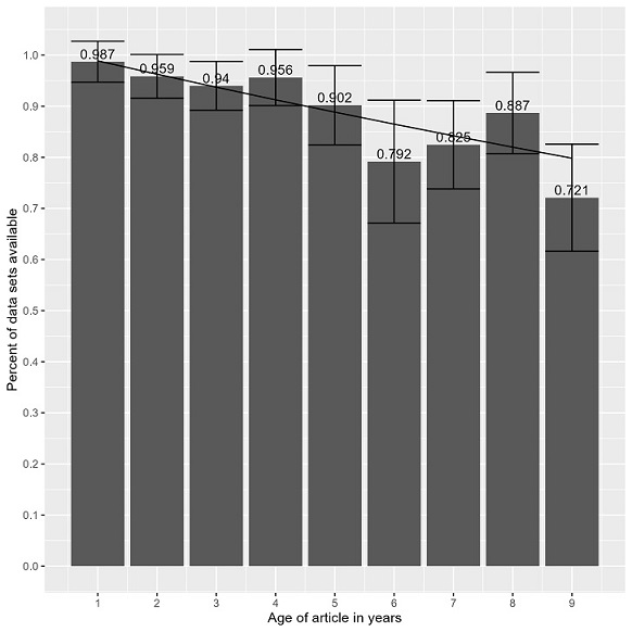
The chart type is “column chart” and the type of data, or y-axis data, is best summarized as “research data availability”. The point of the figure is that “research data on the internet disappears at a rate of 2.6% per year”. Using Cesal’s formula, the alt text for this figure would be :

Column chart of research data availability where research data on the internet disappears at a rate of 2.6% per year. For underlying data, see “Figure2_UnavailableByYear.csv” file at https://doi.org/10.22002/h5e81-spf62.

There are further examples in Cesal’s post to give you a better sense of how the formula works. She also advises repeating the formula for each separate panel in a multi-part scientific figure.

If you want to go beyond Cesal’s basic alt text for data visualizations, chapter four of the Do No Harm Guide offers a really nice look into several models for writing full alt text descriptions for visualizations. The image description guidelines from the DIAGRAM Center also provide more detailed recommendations for specific types of images, such as: chemical elements, Venn diagrams, line graphs, etc. Cesal’s shorthand formula is useful but fuller descriptions are preferable when you are able to write them.

I know this post links to a lot of information about alt text but the important thing is to have something written as alt text because so many images on the internet have no alt text at all. If you want to use Cesal’s quick formula instead of a fuller description, that’s 100 times better than having no image description at all.

Hopefully these resources have prompted you to think more about accessibility of your scientific visualizations so that, at the very least, you’ll include good alt text for the scientific images you share on your lab website, social media, or anywhere!

Posted in accessibility, dataVisualization | Leave a comment

Making Spreadsheets Accessible and Reusable

July is Disability Pride Month. I’ve been learning more about disability during the past year and this has naturally led me to thinking about accessibility of research data. Last year, my friend Abigail co-wrote a really nice call-to-action about making research data more accessible because this is an area where we have to catch up and do better.

As spreadsheets are one of the most common types of shared scientific data, I decided to start my research there. There’s some great content from the U.S. government’s section 508 website on creating accessible Excel files. Similarly, the Web Accessibility Initiative from W3C has a great tutorial on accessible HTML tables. For research data, I also really like the Data Curation Network’s Accessibility Data Primer as a starting point, though spreadsheets are only a small part of the document.

The hard part about shared data though, is that such data is meant to be maximally reusable. For spreadsheets, this means thinking about the accessibility of the most reusable tabular file format: the CSV file. Karl Broman and Kara Woo published my favorite article on making spreadsheets reusable in 2017 but it doesn’t really address accessibility issues. Adding to this problem is the fact that strategies for reusability and accessibility can sometimes be in conflict.

After a bunch of research, I’ve taken a try at a checklist for making accessible and reusable CSV files for data sharing. It balances a bunch of stuff from the Broman and Woo article with a bunch of different guidance for accessibility. For example, I based recommendations for variable naming off of guidance for hashtags that are screen-reader friendly.

The checklist is available as exercise 6.4 in edition 1.1 of The Research Data Management Workbook. (It’s currently only in the online edition of the Workbook and eventually I’ll spin off edition 2.0 of the Workbook and give it a citable DOI.)

Please note: I am not disabled. I am a neurodivergent person with a couple chronic conditions and am not an expert on disability. I am sharing this because I’m requesting feedback so I can make updates to the checklist.

The goal is to create something that a scientist with zero background in accessibility can use to make their data more accessible and reusable. I don’t know if the the checklist will ever be perfect but it should still help make data better.

Let me know what you think of the checklist!

Posted in accessibility, openData | 1 Comment

New Publication Looking at Data Availability Over Time

I’m so excited to share the publication of my article “Measuring Data Rot: An Analysis of the Continued Availability of Shared Data from a Single University” in PLOS ONE. Here’s the abstract:

To determine where data is shared and what data is no longer available, this study analyzed data shared by researchers at a single university. 2166 supplemental data links were harvested from the university’s institutional repository and web scraped using R. All links that failed to scrape or could not be tested algorithmically were tested for availability by hand. Trends in data availability by link type, age of publication, and data source were examined for patterns. Results show that researchers shared data in hundreds of places. About two-thirds of links to shared data were in the form of URLs and one-third were DOIs, with several FTP links and links directly to files. A surprising 13.4% of shared URL links pointed to a website homepage rather than a specific record on a website. After testing, 5.4% the 2166 supplemental data links were found to be no longer available. DOIs were the type of shared link that was least likely to disappear with a 1.7% loss, with URL loss at 5.9% averaged over time. Links from older publications were more likely to be unavailable, with a data disappearance rate estimated at 2.6% per year, as well as links to data hosted on journal websites. The results support best practice guidance to share data in a data repository using a permanent identifier.

I’m really proud of this paper and was incredibly lucky that my institutional repository keeps such good records of links to shared data. It was fascinating to look at where researchers at my institution share data and to see how data is lost over time. It feels good to have added more evidence that you should be following funder guidance to put shared data in a data repository and to share a DOI link to that data.

I hope this analysis is useful for you and you enjoy the article!

Posted in openData, publishing | Leave a comment

DataWorks! Prize Symposium

I blogged in February about how my Library won a DataWorks! prize for our data reuse recipe: the file naming convention worksheet. This month FASEB, the prize sponsor along with NIH, just announced the 2024 DataWorks! Prize Symposium, which will consist of talks by prize award winners about their winning recipes.

There are some amazing projects from the DataWorks! award winners and I am looking forward to hearing about their work. The full agenda is here. I’ll be speaking about file naming conventions at 1:15pm EST/ 10:15am PST and am lucky to share my session with my colleague Karen Yook from microPublication Biology.

I encourage you to register for the event and hope to see you there!

Posted in dataManagement, digitalFiles, openData | Leave a comment

A Basic Strategy for Determining Where to Share Your Data

Deciding on where to share your data can be difficult. The current universal expectation for data sharing is swiftly becoming: put shared data in a data repository. The challenge for researchers is that the data repository landscape is still evolving. Given the number of data repositories available and how many of them specialize in a particular type of data, it can be helpful to understand how to navigate the data repository landscape.

As a librarian who helps people find data repositories for sharing, I have a basic strategy for picking a repository when I am sharing data. It goes as follows:

  1. Identify all of the data that needs to be shared.
  2. Is there is a known disciplinary data repository, such as one used by everyone in your research field for a specific type of data? If so, deposit the relevant data in that repository; continue if there is more data to share, otherwise go to step 7.
  3. Is there a logical disciplinary data repository on this list of recommended repositories? If so, deposit the relevant data in that repository; continue if there is more data to share, otherwise go to step 7.
  4. Does your institution have a data repository? If so, deposit the remainder of your data in that repository and jump to step 7.
  5. Do you have a preferred generalist data repository? If so, deposit the remainder of your data in that repository and jump to step 7.
  6. Pick a generalist data repository and deposit the remainder of your data and continue to the next step.
  7. Record the permanent identifier, ideally a DOI, from each data deposit. If you didn’t receive a permanent identifier, go back and select a different repository for that data.

One important thing to know about this strategy is that it doesn’t assume that you will deposit all of your data in the same data repository. This often happens when you are required to deposit a specific type of data in one repository (e.g. genetic information in GenBank) but that repository doesn’t accept all of the data you need to share. To account for this, you should work your way through repositories from most specific to most general until all of the data has been deposit once.

The other notable thing about this strategy is tacked onto the end: you need a permanent identifier for each data deposit. Having a permanent identifier, such as a DOI, for shared data is a newish requirement but one that will soon be universal from funding agencies. For example, the recent NIH data management and sharing policy requires a permanent identifier for shared data; there isn’t a compliance mechanism for this yet, but expect to report these DOIs back to the NIH within a few years. For now, always make sure you get a permanent identifier such as a DOI or accession number when you deposit your data.

I can’t guarantee that this strategy is perfect but it’s a good place to start when you’re trying to figure out what to do with your data. Hopefully, the data repository landscape will get less confusing, but in the meantime, you have a way to navigate it!

Posted in openData | Leave a comment

A Data Management Philosophy

I’ve been reviewing data management books recently and picked up a copy of “Ecological Data: Design, Management and Processing,” edited by William K. Michener and James W. Brunt. Despite this book being published in 2000, meaning it references outdated technology, this little book is a gem.

One section in the second chapter of the book, written by Blunt, really stuck with me: his data management philosophy. The philosophy relies on an adherence to two principles:

1) Start small, keep it simple, and be flexible
2) Involve scientists in the data management process

The first principle is one I use extensively in teaching data management, even though I’ve never named it explicitly. For example, at the end of most teaching sessions, I remind my audience to start slow by incorporating one data practice at a time. After that practice is routine, researchers can add a second practice until that is routine, etc.

As for flexibility, this is what makes it a joy and a pain to teach data management. The answer to so many questions I get from researchers about how to manage data is “it depends”. It depends on their workflows and what works best for them. I can teach how to create a file naming convention but the best file naming convention depends on the files and how one searches for them. And even then, sometimes people have to bulk rename files to make them easier to organize and find. Data management must be flexible because research is so heterogenous.

The second of Blunt’s principles really reinforces the need for data management to be context dependent. A small group of researchers is going to know best how to organize and manage their files. Similarly, scientific subfields have developed norms for metadata and data sharing, building systems that work best for those researchers.

Some of my favorite data management outcomes have come from consultations where I provide the structure, the researcher provides the context, and we jointly come up with something that works really well. Scientists don’t have to know all about data management, but data management really shines when scientists are involved in the data decisions.

I think Blunt’s data management philosophy lays a pretty good foundation. It aligns with the way I teach and consult on data management and will be a useful framework for going forward.

If I had to come up with my own data management philosophy, I might borrow an adage from camping: leave the campsite better than you found it. For camping, this means to not only pack out whatever you packed in, but to also find ways to improve your surroundings so that the effect of humans being present is less notable. For data management, I interpret the adage to mean that you should keep making improvements, no matter how small. So, while it can be nice to have large structures to protect us from the elements, the small things (like keeping everything tidy and clean) really do have a big impact. It’s not a perfect metaphor but it still encapsulates the way I think about a lot of incremental data management strategies.

I know that these are not the only data management philosophies out there, but they do provide an interesting insight into some ways to engage with data management. Do you have a data management philosophy?

Posted in dataManagement | Leave a comment