We’ve thankfully reached the end of 2025. It’s been a rollercoaster of a year, with lots of ups and downs both personally and professionally. On the professional side, I’ve had some really solid highlights, so it seems fitting to review them in a blog post.
Publications
I had a very good publication year. My third book came out in December:
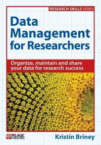
- Briney, K. (2025). The Data Management Workbook: Practical Exercises for Better Organization, Storage and Use of Your Research Data. Exeter, UK: Pelagic Publishing.
I also published two articles: a bibliography of data management books for researchers (a list that I recently made out of date); and an article about developing the exercises in my new book.
- Goben, A., & Briney, K. A. (2025). Data Management Books for Researchers – An Annotated Bibliography. RIO, 11, e154845.
- Briney, K. (2025). The Research Data Management Workbook: Building a Collection of Data Management Exercises to Bridge Data Information Literacy and Data Management Implementation. Journal of eScience Librarianship, 14(1), e937.
And I almost forgot about the book chapter that came out this year (books take forever between the writing and publication):
- Goben, A., Coates, H., & Briney, K. (2025). The Library is Not Enough: Building the Data Governance Community at Your Institution. In E. Bongiovanni, M. Gainey, C. Greigo, & L. Beltranthis (Eds.), The Open Science Cookbook. ACRL.
Public Access
I spent a good part of 2025, and plan to spend a good part of 2026, supporting the new public access policies from US funding agencies. As a librarian, it’s been incredibly frustrating to be caught between funder requirements for public access and publisher open access policies that often conflict. I think that most people agree that the current scholarly publishing industry is too expensive and isn’t working, but it’s really messy to be working in this area as we try to transition to something better. For everyone’s sake, I hope 2026 is easier in this area.
ASL
I’m currently 80% done with a certificate in American Sign Language (ASL); I have to take one more class this spring, ASL 4, in order to finish. I think it’s a great idea for someone in public service to know how to communicate with Deaf patrons, which is why I’m taking advantage of my university’s tuition assistance to work on this certificate. I don’t think I’ll ever be fluent in ASL, but I’m definitely more comfortable communicating in this language and have enjoyed learning about Deaf culture.
Looking Forward
I’m ended 2025 with some good news: I just signed a contract to write my fourth book. I’ve already drafted a few chapters and will share more information once I draft more. I can tell you it’s about data management and sharing, which is probably not a surprise.
I hope you have a restful holiday season and a wonderful 2026.