A Framework for Choosing the Right Visualization Type for Your Data

I’m starting to do more work in the area of data visualization, as evidenced by my most recent publication and my somewhat periodic Twitter rants against pie charts. While I’ve already discussed one of my favorite visualization resources on the blog, I have not discussed how I approach data visualization. Particularly, I want to share the framework I teach in my visualization workshops.

The framework involves three steps:

  1. Determine your message
  2. Determine what type of data this corresponds to
  3. Choose the best visualization format to match the message and data type

Let’s break each step down in more detail.

The first step in any visualization is determining what you want say. While you can just visualize all of your data and let the reader decide, this makes more a lot work for the reader; they’ll either give up or take time away from understanding some other key point in your work to understand the data in this visualization. To illustrate why message is important, consider Nathan Yau’s exercise in visualizing the same data 25 different ways. Each visualization highlights a different nuance of the data and causes the viewer to interact with the data differently. So the message is key to determining which is the “best” in the set of 25. In your figures, you can both be transparent by visualization everything and frame things in a way to make a point. Basically, having a message can really help you add clarity to a figure.

Once you determine your message, you’ll next want to consider what type of data you’re working with. For example, while you might have survey results, depending on your message you could really be trying to visualize a single number, a comparison, a change over time, etc. Each of these data types merits a slightly different visualization strategy. So spend some time thinking about your message and how it directs the specific data features you want to highlight.

The final step in this framework is to actually chose the type of visualization or chart to use. By making this decision last, you can reflect on how the chart type best lines up with what you’re trying to say. As you pick your chart type, continually ask if this visual fits your message. If it doesn’t, pick a different chart type.

I fully admit to building this framework off the work of Stephanie Evergreen. If you want some structure for determining the best chart types for different data types, I recommend checking out her book “Effective Data Visualization”. For qualitative data, she also has a qualitative chart chooser on her website. These resources will help you make the jump from data types to chart types.

I should also note that this framework is for visualizing final results. If you’re looking to do visualization for exploratory analysis, that’s a totally different topic and one with other resources (e.g. Tukey’s “Exploratory Data Analysis” or R’s summarytools package).

So that’s one way to start thinking about making good visualizations. If you’re going to go to the effort to visualize your data, I challenge you to make your visuals their most effective by determining your message and the key data features before you decide on the chart type.
Posted in dataVisualization | Leave a comment

Privacy v Confidentiality

I’ve been thinking a lot recently about the difference between privacy and confidentiality. This issue surfaces in libraries around handling patron data (relevant to my current line of research) but also more generally in how researchers handle human subjects data. I think it’s important to recognize the difference between privacy and confidentiality and how this might play out in dealing with research data.

Privacy is a concept centered on the person from which the information originates. It entails that individual’s personal information and their discretion in disclosing it to others. I’m not going to attempt to define the “privacy” (there are plenty of privacy scholars who have already done this) but instead want to highlight that here I’m applying the term to an individual’s choices about their own information.

Confidentiality instead centers on the entity that holds someone else’s personal information and their duty to not expose that information further. Some professions, such as doctors and lawyers, routinely deal with confidentiality but it’s an important concept to apply to personal information more broadly.

So, being a blog on data management, how does this apply to research data? First, it’s important to think about privacy in how we collect data. When do we need specific sensitive information versus when can we go without it? What is the impact on the person disclosing sensitive information? What is considered private information and how is that clearly defined and communicated?

When we do need to collect personal information for research, the second part is to think about confidentiality in ensuring that information is not further disclosed. How will the data be secured? Who is allowed access to the data, such as for a research team, and how is this communicated to the research participant? What will happen to the data at the end of the project?

As you can see, privacy and confidentiality play out during different phases of the research process yet are both important when doing research involving personal information. We, as researchers, keep data confidential to help maintain other people’s privacy. So while they are different concepts and actions, confidentiality does have its roots in privacy.

There are many nuances in the types of data that may be considered private, but it’s worth recognizing that, as researchers, we have a role in both navigating disclosure of personal information as well as then securing that information to maintain confidentiality. I hear a lot of discussions about privacy, but I think it’s just as important to discuss the role of confidentiality when we do have to collect sensitive information.

Posted in dataManagement, privacy | Leave a comment

Come Hear My Thoughts on Data Management and Learning Analytics

I mentioned way back in December that I fell down a research rabbit hole at the end of 2017 but I never said what that rabbit hole was: it’s about data management and library learning analytics. I’m not quite ready to reveal the full results of that research project (the paper is currently working its way through the publication process), but I will be discussing my results at the ALA Annual Conference in New Orleans next week!

The session I’m speaking at is called “Libraries and Learning Analytics: Identifying the Issues” and is on Saturday, June 23 at 2:30-3:30pm in Morial Convention Center, Rm 395-396.

My talk is actually a follow up of my ALA 2017 talk but with actual research results to share. I’ll be specifically discussing anonymization, consent, and security, because hooboy do I have some things to say in these areas.

If you can’t make it to ALA, I’ll be posting the slides afterwards and hopefully you’ll see the paper in the near future too!

[Added 2018-06-26] Slides now available here: Briney ALA presentation file

Posted in admin | Leave a comment

Why a Bar Chart is Sometimes Better than a Column Chart

Today on the blog, I’m going to talk about the difference between a bar chart (right-left bars) and a column chart (up-down bars). For many, the difference seems negligible — simply the direction of the bars — but the choice between the two can often make a difference in terms of readability of your chart.

I’ll demonstrate my point using a recent published example of a column chart that might be better as a bar chart. The paper the chart comes from is really great and my critique of its Figure 6 in no way means that I don’t find the rest of the article to be of excellent quality. The chart is one of several examples I’ve seen but I’m allowed to reproduce it here under a CC BY license.

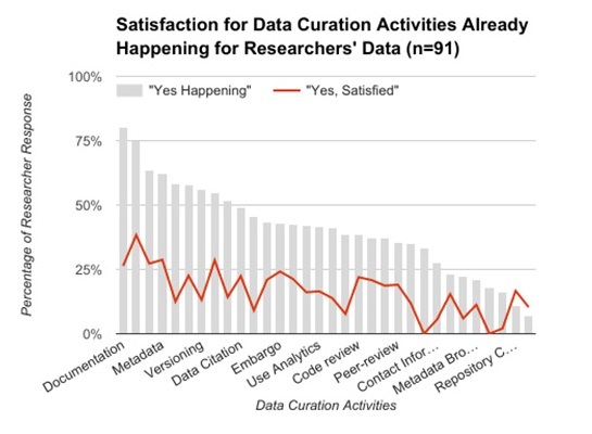
Here is the column chart in question. It displays where data curation actions are happening and overlays people’s satisfaction with that activity. Can you spot the major issue?

Column Chart "Satisfaction for Data Curation Activities Already Happening for Researcher's Data"
Reproduced from: Johnston, L.R. et al. , (2018). How Important is Data Curation? Gaps and Opportunities for Academic Libraries . Journal of Librarianship and Scholarly Communication . 6 ( 1 ) , p . eP2198 . DOI: http://doi.org/10.7710/2162-3309.2198 [Reproduced here under a CC BY license]

I’m really interested in the findings in the chart but I can’t get much actionable information out of it because so few of the columns are labelled (or even fully labelled). Additionally, it’s difficult to match the existing labels to columns due to the diagonal orientation of the text. All this is an artifact of the charting software compressing labels to fit in the allotted space.

The key point I want to make is that label dropping is less likely to happen in a bar chart (right-left bars). It’s usually easier to make a chart taller than to make it wider in order to provide the necessary label space. Plus, the text automatically orients itself in the proper direction so you don’t need to turn your head to read the chart. Overall, this makes for a more readable, more usable chart.

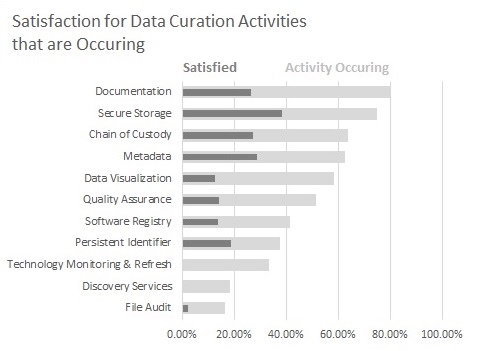
To show the difference, I reproduced a subset of the column chart as a bar chart. I think that it’s much easier to read and take away concrete findings because you can interact with every category in the chart.[1]

Bar chart reproduction of original column chart using a subset of data
Data from: Johnston, L.R. et al. , (2018). How Important is Data Curation? Gaps and Opportunities for Academic Libraries . Journal of Librarianship and Scholarly Communication . 6 ( 1 ) , p . eP2198 . DOI: http://doi.org/10.7710/2162-3309.2198

So next time you’re making a column chart that needs a lot of labels, I hope you consider using a bar chart instead. It really does make a difference and your readers will appreciate a more readable chart.


[1] There’s an artifact in Excel not letting me use an overlay line as in the original chart but I think the overlapped bars sufficiently demonstrate the original point.

Posted in dataVisualization | Leave a comment

File Formats

Every once and a while, I run across a topic and think, “surely I’ve covered this one my blog?” The most recent of these topics, which came up when I wrote December’s Exit Strategy post, concerns file formats.

File formats and exit strategies go hand-in-hand, as you don’t want to be stuck with inaccessible data in an unreadable file format. Proprietary, out-of-date, little used formats lower the chance that you’ll be able to access your data when you need it. Ask anyone with 20-year old files if they can use those files and you’ll likely see why file formats matter.

When it comes to choosing file formats that last, file types actually exist a spectrum. The best formats are open, well-documented, and in wide use. Clear examples are .TXT instead of .DOCX, or .CSV instead of .XLSX or .SAS. In the middle of the spectrum we find something like .PDF, which is an Adobe file format but in such wide use that it will be usable for many years. Also note that the spectrum of preferred file formats shifts over time (hello Lotus Notes and WordPerfect!).

Since there is no one right answer for any data type, the key thing for picking a good file format is to ask yourself if your content is currently in a file format that is uncommon or can only be opened by a specific software program. If the answer is yes, now is the time to make a backup copy of that data in a more open format. Even if you lose some formatting in the process, it’s better to have some data in an open format than having no data because it’s locked in an unreadable format. By making a copy, you also don’t have to lose the performance of the original file format while gaining the sustainability of the new; you can, of course, wholly switch to a better format if that is feasible. It’s also worth reviewing old data for formats that are no longer popular or supported.

Good data management is the sum of a number of small practices and picking good files formats is a piece of this puzzle. The more you are aware of how closed your current file formats are, the better you can plan for making that data usable into the future.

Posted in dataManagement | Leave a comment

Eating Our Own Carrot Sticks

One phrase that’s bound to come up at every data management conference is “carrot versus stick” vis-a-vis incentivizing researchers to manage their data better. Carrots are rewards for good practices and sticks are requirements and their consequences relating to data management. There is inevitably discussion over which method is more effective for implementing data management.

Another phrase that I often hear in similar settings is “eating our own dog food” or “drinking our own champagne”. This is another way of saying “practice what you preach”, in that data experts should apply their advice to their own files.

These phrases are used so often that I’ve decided that they need to be combined as “eating our own carrot sticks”. It’s at least more appetizing than some of the other “eating our own…” options and a bit of snarkiness provides relief from predictability.

But to say something serious in this blog post, all of these phrases emphasize the importance of *doing* data management. It’s not enough to have the knowledge or to be given the incentive. It is only in the act of actually managing the data that we get value.

So I challenge you, whether you are a data management novice or an expert, to find one new data management practice to implement this month. Because a carrot stick a day keeps the data disaster away*.


* Okay, now I’m taking it too far, I know. I can’t help myself.

Posted in dataManagement | Leave a comment