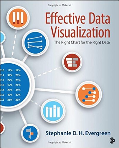
 I know a little bit about a lot of data things, but one area I’m weak in is data visualization. Sure, I can make a graph in Excel but that doesn’t mean that the graph is necessarily good. Thankfully, Sal Gore blogged a recommendation for the book Effective Data Visualization and, after a quick read, I’m feeling like a data viz wiz.
What I like about this book is that it doesn’t assume you have data visualization knowledge apart from basic familiarity with Excel. That’s actually a plus for this book, as the author Stephanie Evergreen shows you how to make most of these charts IN EXCEL. I know I’ve previously ragged about Excel on this blog but it really is the first place most people start with data viz. So if we’re all going to start there, at least this book shows you how to make your Excel charts not suck. Even better, Evergreen tells you how difficult a chart will be to create in Excel by including a helpful Excel ninja rating.
The other thing that’s great about this book is that charts are organized by the type of data you want to present. Categories include: a single number, comparisons, beating a benchmark, survey results, parts of a whole, correlations, qualitative data, and data over time. Evergreen bases her selection of charts on research showing which chart types are more effective for information retention. It’s a different way to think about charts, but one that I’m finding really useful.
The range of covered charts includes the usual suspects, from bar charts to scatter plots, but Evergreen also details visuals that I haven’t used before. The ones I plan to immediately add to my graphing repertoire are: icon arrays, slopegraphs, dot plots, back-to-back bar charts, and small multiples graphs.
Beyond choosing the right chart and knowing how to make it in Excel (which, of themselves, are incredibly useful skills), this book gave me a framework for creating charts that are easy to read and convey a clear message. For example, I now understand how to write an effective chart title, select good colors, reduce data overload, and eliminate chart junk. It’s reached the point where I can’t even look at my old graphs without wanting to tweak them.
There is one downside of this book and it’s that it was done with two-color printing. All of the charts are limited to shades of blue and grey. While this makes for a visually cohesive (and cheaper) book, the printed figures occasionally do not fully convey the author’s point – most often when showing a bad chart. This is annoying but it’s not enough to detract from the many good things about this book.
Overall, Effective Data Visualization is the perfect book for people who want to level up their data visualization skills beyond the defaults in Excel. I’ve learned so much from this book and it has fundamentally changed the way I think about visualizing data. I hope that you will find it just as useful.


Thanks for recommending this, Kristin! It looks useful and I look forward to reading it.